
State of the climate: 2021 sees widespread climate extremes despite a cool start
Zeke Hausfather
07.26.21Zeke Hausfather
26.07.2021 | 8:00amWhile the early months of 2021 have been cooler than much of the past decade, global temperatures have risen in recent months as the effects of La Niña have started to fade.
This year is now on track to end up somewhere between the fifth and seventh warmest year for the Earth’s surface since records began in the mid-1800s.
The past two months have seen record-breaking heatwaves in the western US and Canada that are fuelling devastating wildfires, as well as flooding events in Europe, India and China driven by extreme rainfall.
A recent attribution analysis found that the deadly heat experienced in the Pacific north-west would have been “virtually impossible” in the absence of climate change. While attribution studies on the extreme rainfall events have yet to be completed, climate models have long predicted strong increases in extreme rainfall events associated with climate change.
Arctic sea ice has also been at record low levels for most of the month of July. While it is too early to know for sure where the summer minimum will end up, 2021 will likely see one of the lower Arctic sea ice extents on record.
Exceptional summer heat and flooding
Global average temperatures have been cooler so far this year than in much of the past decade. However, these global averages can mask a lot of regional extremes that can have large impacts on people.
A number of regions – including the north-western US and western Canada – have seen all-time high temperature records broken in 2021. The figure below shows areas where a new maximum surface temperature records (in red) have been set in 2021 as of mid-July in the Copernicus/ECMWF ERA5 reanalysis dataset. (This is a surface temperature estimate based on a combination of measurements and a weather model.)
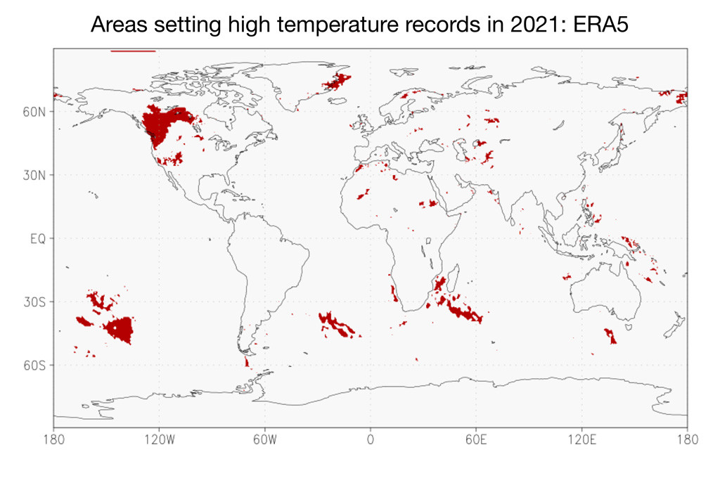
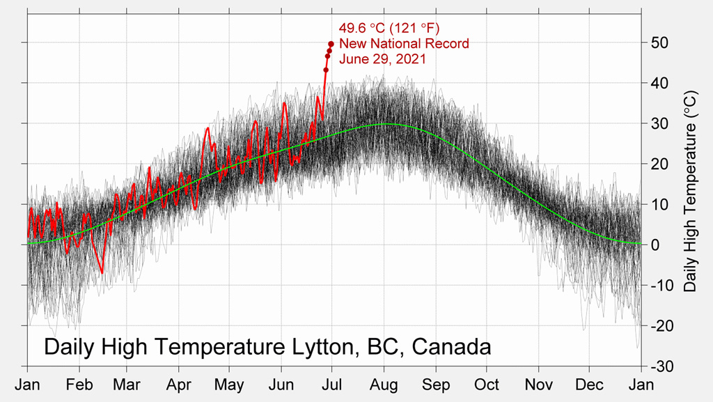
The late June heatwave in the Pacific north-west was particularly exceptional, with some areas experiencing temperatures 20C (36F) warmer than normal. Portland, Oregon, set an all-time high temperature record of 47C (116F), breaking the prior record by 5C. The town of Lytton in British Columbia, Canada, set an all-time high record for the entire country of nearly 50C (121F), before being largely destroyed by a catastrophic wildfire the following day. The extreme heatwave resulted in hundreds of deaths in the region.
The figure below shows the daily temperature record for Lytton, with the four days in which subsequent all-time records were set shown by red dots.
The World Weather Attribution (WWA) group published a rapid attribution study of the June heatwave. They found that the degree and extent of extreme heat experienced in the region would have been “virtually impossible” in the absence of warming caused by human emissions of CO2 and other greenhouse gases.
Their analysis pointed out that the heatwave would have been an exceedingly unlikely at least 1-in-150,000 event in the absence of climate change; with historical warming they found it was closer to a 1-in-1000 year event. However, in a world where global average temperatures are 2C above pre-industrial levels – which may happen by the 2050s if the world does not reduce its emissions – they pointed out that this sort of heatwave could occur as often as once or twice per decade.
The WWA team also suggested that their approach could potentially underestimate the current odds of these sorts of extreme heat events. Their analysis was based on the effects of the average warming of summertime maximum temperatures experienced by the region to-date. It is also possible that climate change may be affecting weather patterns in the region in other ways, making temperature more variable as well as warmer, though there is limited evidence to-date.
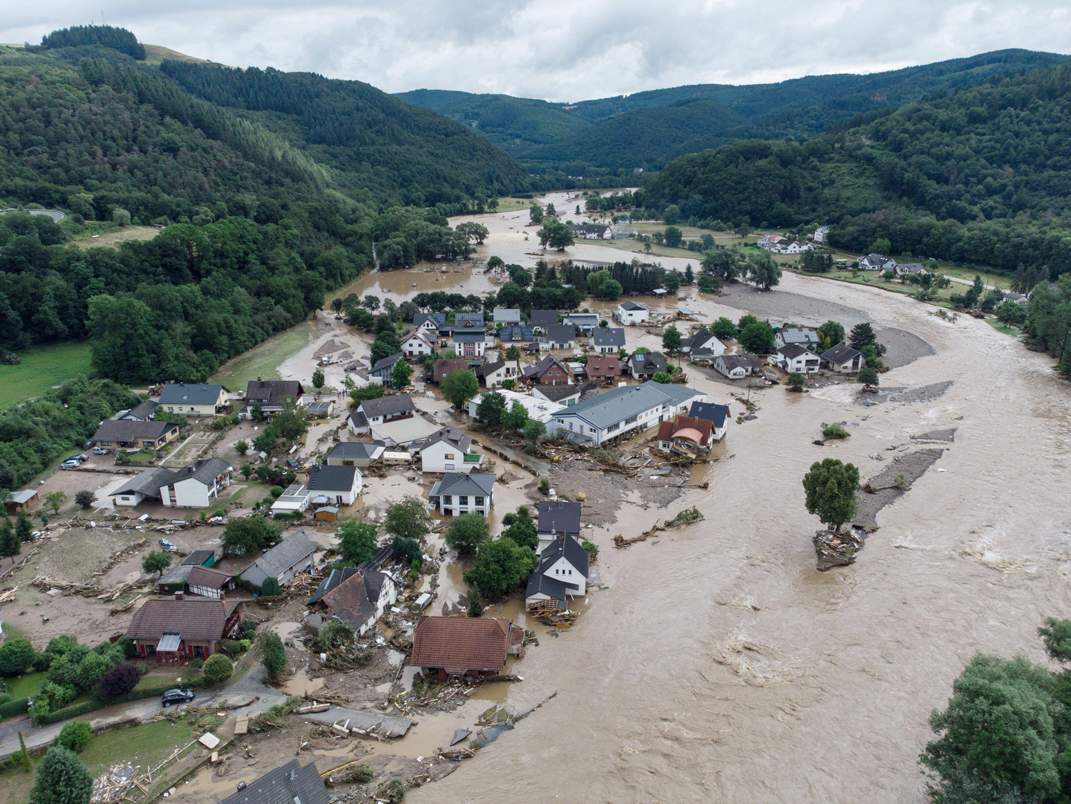
In addition to extreme heat, this summer has seen extreme rainfall events in northern Europe, China and other locations. In Germany and Belgium, intense storms dropped six inches (15 cm) of rain in a 24-hour period, resulting in catastrophic flooding that has claimed nearly 200 lives – a number that will likely grow as many are still missing. In China, a year’s worth of rain fell in the Henan province’s capital Zhengzhou in just four days, displacing over 100,000 people and resulting in at least 33 deaths across the province.
While it is too soon to say with confidence exactly how much climate change contributed to these floods – as attribution studies have yet to be undertaken – more intense precipitation events have long been a robust prediction of climate models. A warmer atmosphere can hold more moisture – about 7% more per 1C of warming. Models project that most of the world will have a 16-24% increase in heavy precipitation intensity by 2100 in a high emissions scenario.
Annual average temperature
The first six months of 2021 were cooler than most years in the past decade – but still quite warm compared to almost all prior decades since records began in the mid-1800s. Carbon Brief has analysed records from six different research groups that report global surface temperature records: NASA; NOAA; Met Office Hadley Centre/UEA; Berkeley Earth; and Copernicus/ECMWF.
The table below shows the ranking of months in 2021 compared to the same month in all prior years since records began.
| Hadley/UEA HadCRUT5 | NASA GISTEMP | NOAA GlobalTemp | Berkeley Earth | Copernicus/ECMWF | |
|---|---|---|---|---|---|
| Jan | 9th | 8th | 7th | 6th | 6th |
| Feb | 15th | 15th | 16th | 16th | 12th |
| Mar | 9th | 7th | 8th | 9th | 9th |
| Apr | 7th | 8th | 9th | 7th | 7th |
| May | 9th | 8th | 6th | 8th | 5th |
| Jun | 3rd | 5th | 5th |
The year started out as relatively cool, with February 2021 being between the 12th and 16th warmest February on record. Recent months have seen warmer temperatures, with June 2021 between the third and fifth warmest on record and July 2021 likely on track to be one of the Top 5 warmest Julys.
These global averages also conflate some notable regional differences. For example, 2021 saw the second warmest June over land regions and the warmest on record for North America in the ERA5 dataset.
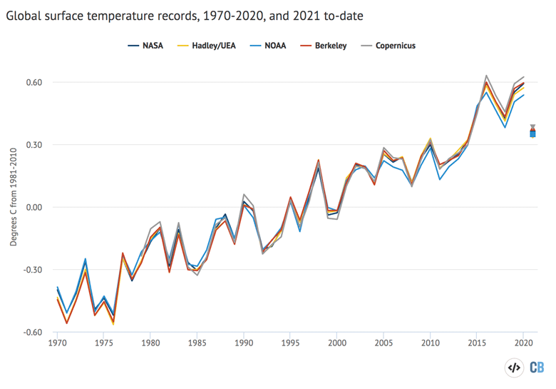
The chart below compares the annual global surface temperatures from these different groups since 1970 – or 1979 in the case of Copernicus/ECMWF. The coloured lines show the temperature for each year, while the dots on the right-hand side show the year-to-date estimate for January to June 2021 (or January to May for Berkeley Earth and Hadley/UEA datasets, for which June values were not available at the time this article was published). Values are shown relative to a common baseline period – the 1981-2010 average temperature for each series. Surface temperature records have shown around 0.9C warming since the year 1970, a warming rate of between 0.18C and 0.2C per decade, depending on the dataset.
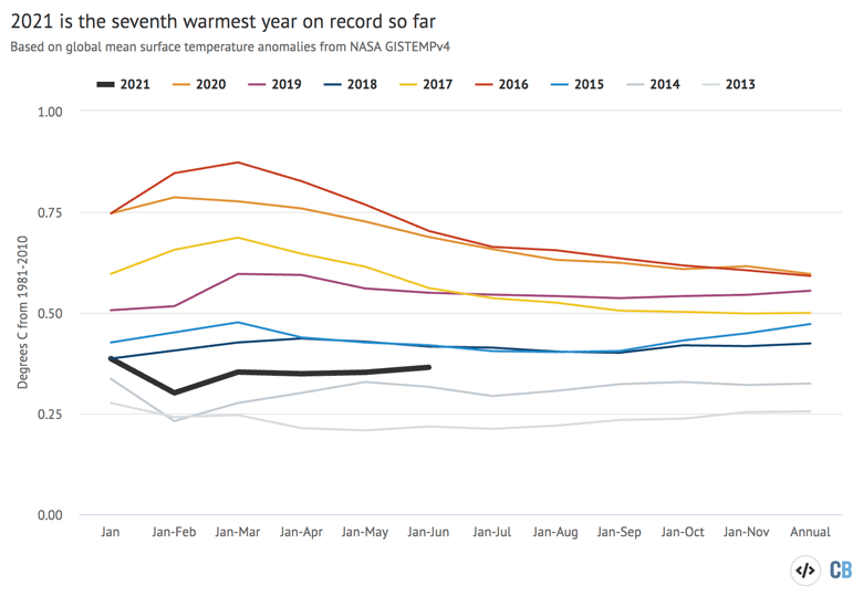
The figure below shows how temperatures so far in 2021 (black line) compare to prior years (grey lines) in the NASA GISTEMP dataset. It shows the temperature of the year-to-date for each month of the year, from January through to the full annual average. In the NASA dataset, 2021 is the seventh warmest year on record so far, cooler than the past six years but warmer than any other year since records began.
While human emissions of CO2 and other greenhouse gases are responsible for all of the Earth’s long-term warming, temperatures in any given year are strongly influenced by short-term variations in the Earth’s climate that are typically associated with El Niño and La Niña events (collectively referred to as ENSO). These fluctuations in temperature between the ocean and atmosphere in the tropical Pacific help make some individual years warmer and some cooler.
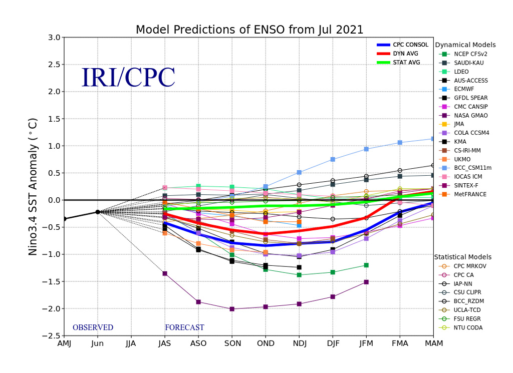
The first half of 2021 saw moderate La Niña conditions, which contributed to temperatures being a bit lower than those of the past few years. Predictions from models for the remainder of the year are mixed, with some predicting the return to modest La Niña conditions and others predicting ENSO-neutral conditions.
The figure below shows a range of different ENSO forecast models produced by different scientific groups. The values shown are sea surface temperature variations in the tropical Pacific – the El Niño 3.4 region – for three-month periods. The dynamical model average is shown in red, while that for statistical models is shown in green.
The first half of 2021 can give some sense of what to expect for the entire year. By looking at the relationship between the first six months and the annual temperatures for every year since 1970 – as well as ENSO conditions for the first half of the year and projected conditions for the remaining half – Carbon Brief has created a projection of what the final global average temperature for 2021 will likely turn out to be.
The analysis includes the estimated uncertainty in 2021 outcomes, given that temperatures from only the first half of the year are available so far.
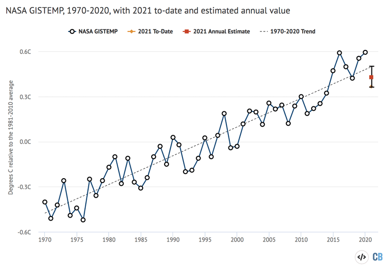
The projection suggests that 2021 is very likely to be somewhere between the fifth and seventh warmest year on record.
While cooler than the past few years, 2021 temperatures are quite consistent with what would be expected given the long-term warming trend (dashed line). It also suggests that the remaining half of the year will see global average temperatures a bit warmer than the first half as the effects of La Niña fade.
Comparison with models
Climate models provide physics-based projections of warming given different assumptions about future emissions, greenhouse gas concentrations and other climate-influencing factors.
The figure below shows the range of individual models forecasts featured in the Intergovernmental Panel on Climate Change’s (IPCC) fifth assessment report – known collectively as the CMIP5 models – between 1970 and 2020. The black line and grey shading indicate the average projection and spread, respectively, across all the models. Individual observational temperature records are represented by coloured lines.
In these models, estimates of temperatures prior to 2005 are a “hindcast” using known past climate influences, while temperatures projected after 2005 are a “forecast” based on an estimate of how things might change.
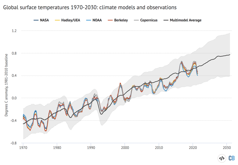
While observed global temperatures were running a bit below the pace of warming projected by climate models between 2005 and 2014, the last few years have been pretty close to the model average.
Arctic sea ice at record lows
Arctic sea ice extent spent much of early 2021 at the low end of the historical 1979-2010 range, though over the past few weeks sea ice extent has dropped rapidly, setting new records over much of the month of July.
In the southern hemisphere, Antarctic sea ice was close to the long-term average over the first seven months of 2021. Reliable sea ice coverage data is only available since polar-observing satellites were launched in the late 1970s.
The figure below shows both Arctic and Antarctic sea ice extent in 2021 (solid red and blue lines), the historical range in the record between 1979 and 2010 (shaded areas) and the record lows (dotted black line). Unlike global temperature records, sea ice data is collected and updated on a daily basis, allowing sea ice extent to be viewed through to the present.
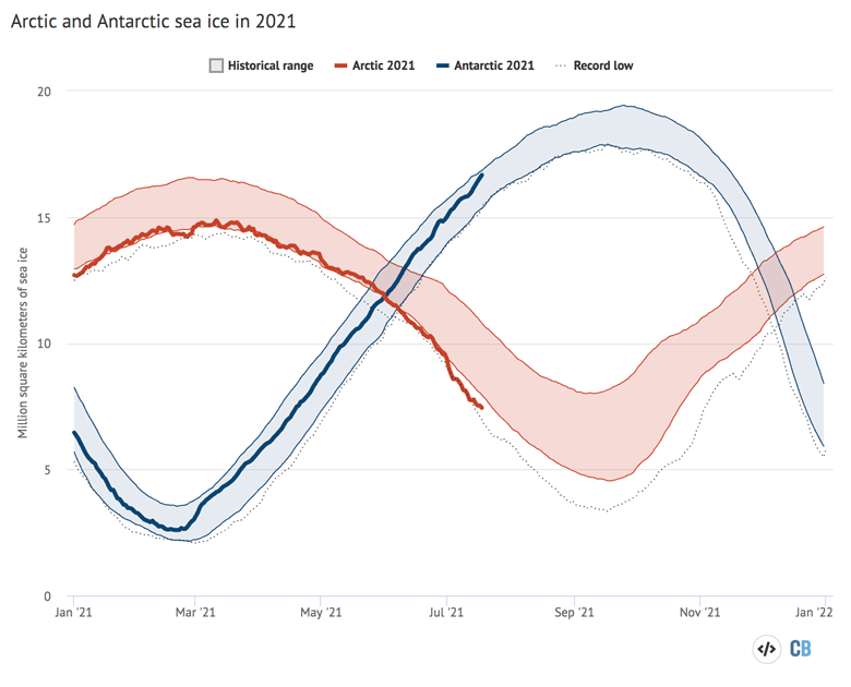
The summer Arctic sea ice minimum is a somewhat iconic figure and recent years have yet to drop below the record low set in 2012. While Arctic sea ice is currently near record lows for this time of year, it is unclear if these conditions will persist and it is still too early to know where the 2021 minimum will fall.
The chart below shows the average Arctic sea ice extent for each week of the year for every year between 1978 and 2020, with 2021 to-date highlighted with a thick black line.
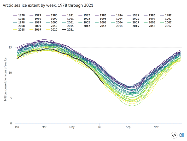
The figure shows a clear and steady decline in Arctic sea ice since the late 1970s, with darker colours (earlier years) at the top and lighter colours (more recent years) much lower. A typical summer now has nearly half as much sea ice in the Arctic as it had in the 1970s and 1980s.
Finally, it is worth noting that sea ice extent only tells part of the story. In addition to declining ice extent, the sea ice that remains tends to be younger and thinner than ice that used to cover the region. The figure below, using data from the Pan-Arctic Ice Ocean Modelling and Assimilation System (PIOMAS), shows the Arctic sea ice thickness for every year between 1979 and 2021.
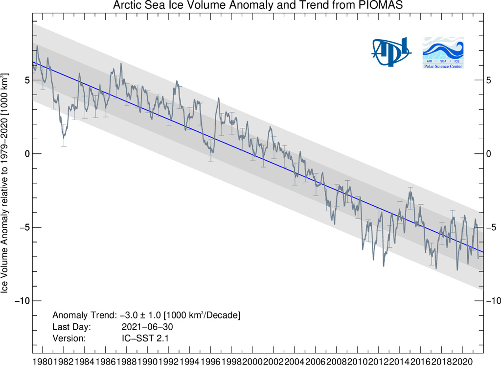
While sea ice volume is currently above its prior record low values, it is still well in-line with the long-term downward trend.
-
State of the climate: 2021 sees widespread climate extremes despite a cool start

