Rock-bottom prices and geopolitical tensions mean oil is rarely out of the news. Over the past decade, however, two key trends have emerged, with thousands of shale oil wells springing up across the US and demand for oil in China soaring.
Beyond these major currents, a multitude of other stories lie swirling beneath the surface. Carbon Brief has plotted the global oil trade in a series of charts, to shine a light on these dynamics.
Oil flows
The two charts above show how the world traded oil in 2004 and 2014. Each chart is a Sankey diagram showing the flow of oil exports and imports around the world.
The width of each ribbon is proportional to the quantity of oil it represents. Mouse over the ribbons to see the countries and regions trading the most oil. Hover long enough and numbers pop up.
The first thing you should be able to see is the large increase in trade flows from 48m barrels a day in 2004 to 57m b/d in 2014. Oil import volumes increased by 18% over that decade, much faster than overall consumption, which grew by only 11% to 92m b/d.
This difference reflects changes in regional patterns of oil production and consumption, primarily the rise of both US output and Asian demand. You can see these trends in the Sankey diagrams.
Shale revolution
They show how US oil exports have increased and its imports rapidly decreased. We’ve broken out these shifts in the graph, below. As well as the dramatic reduction in imports, you can see that US demand for Mexican, African and south American oil is down while imports from Canada are up.
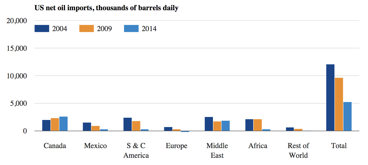
Net oil imports to the US from its major trading partner countries and regions in 2004, 2009 and 2014 (thousands of barrels per day). Source: BP Statistical Review of World Energy 2005, 2010 and 2015. Chart by Carbon Brief.
Rise of China
Meanwhile, imports into China, India and other Asian countries have grown. Oil consumption in the richer OECD nations has fallen by 9% in the decade to 2014, while non-OECD demand is up a staggering 41%.
The graph below shows the situation for China, where rapidly rising demand has been met from across the world, but, in particular, from South America, the former Soviet states, the Middle East and Africa — but mainly west African nations, such as Nigeria and Angola.
Perhaps surprisingly to those outside the oil industry, China is a major producer. Its 4,246m b/d production in 2014 was more than Iran, Iraq or Canada. So, its imports only reflect part of its demand for oil.
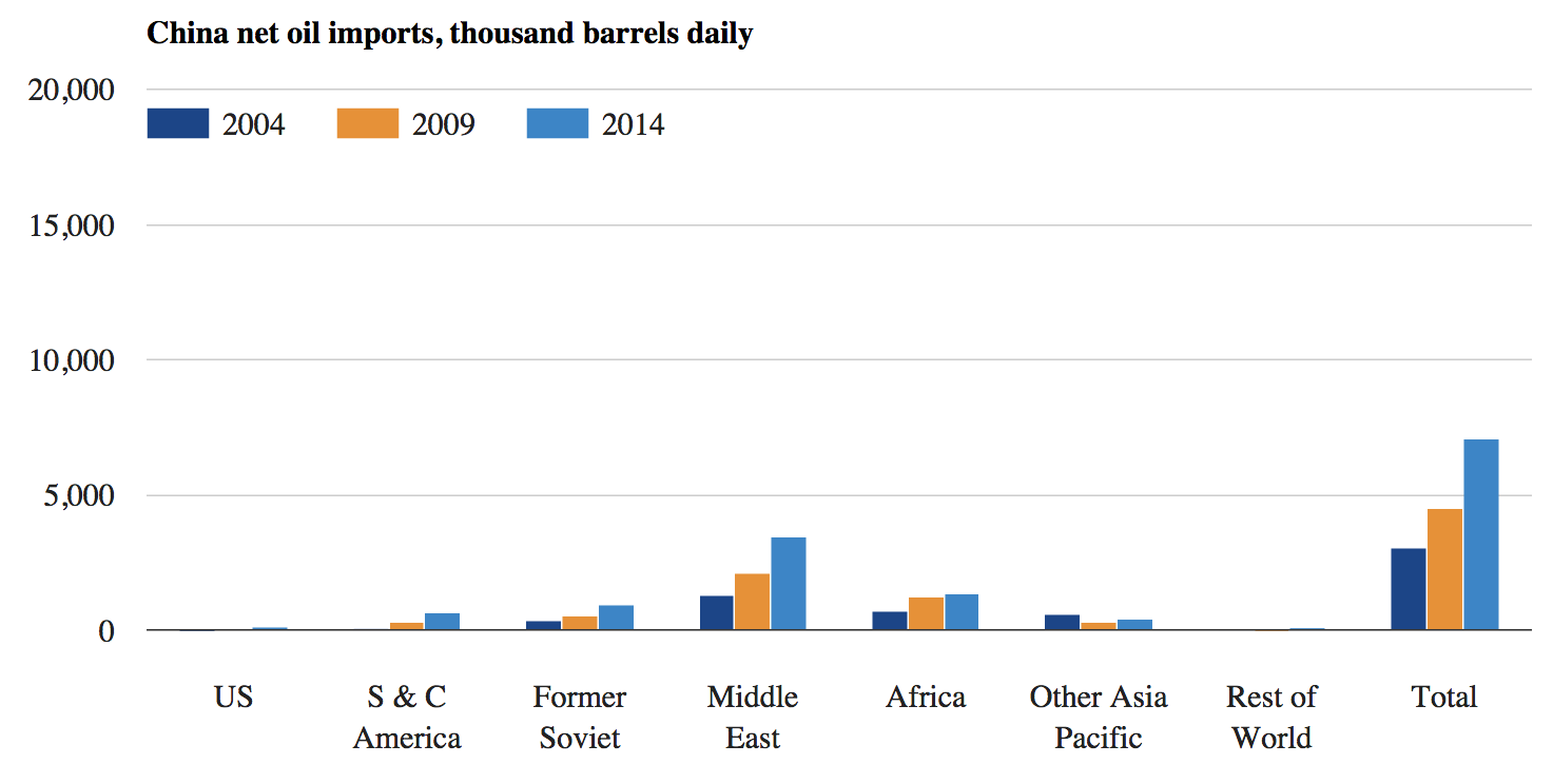
Net oil imports to China from its major trading partner countries and regions in 2004, 2009 and 2014 (thousands of barrels per day). Source: BP Statistical Review of World Energy 2005, 2010 and 2015. Chart by Carbon Brief.
Middle East pivot
Several other points are notable in the Sankey diagrams. The volume of Middle East oil exports has been fairly steady, though the destination has shifted away from Europe and the US, towards Asia, as the chart below shows. The reduction in Japanese imports reflects falling total demand.
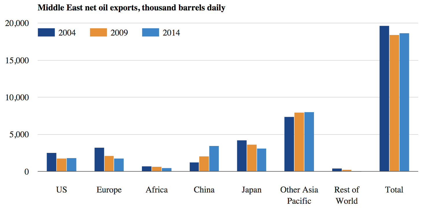
Net oil exports from the Middle East to its major trading partner countries and regions in 2004, 2009 and 2014 (thousands of barrels per day). Source: BP Statistical Review of World Energy 2005, 2010 and 2015. Chart by Carbon Brief.
Russia’s rise
Former Soviet states have also pivoted towards Asia, while significantly ramping up exports. Europe remains the largest market by far for oil from the likes of Russia, as you can see in the chart above.
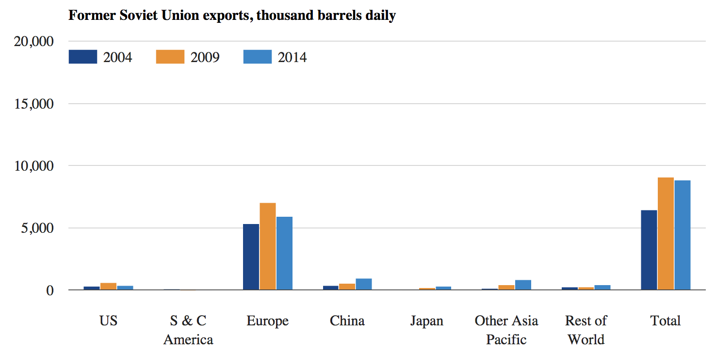
Net oil exports from former Soviet states to their major trading partner countries and regions in 2004, 2009 and 2014 (thousands of barrels per day). Source: BP Statistical Review of World Energy 2005, 2010 and 2015. Chart by Carbon Brief.
Efficient Europe
Like Japan, European oil consumption is down by nearly a fifth since 2004, a huge reduction that reflects improving vehicle efficiency standards and the after-effects of the economic crisis.
Overlaid on this drop, the source of European oil has changed, too. Home-grown production is in decline. West Africa is replacing north African imports in the wake of the Arab Spring and Middle Eastern imports are also falling.
It’s worth noting that Europe imports hardly any Canadian tar-sands oil, despite loud debate on the issue. The US used to be a net oil importer from Europe. Now it is a net exporter to Europe.
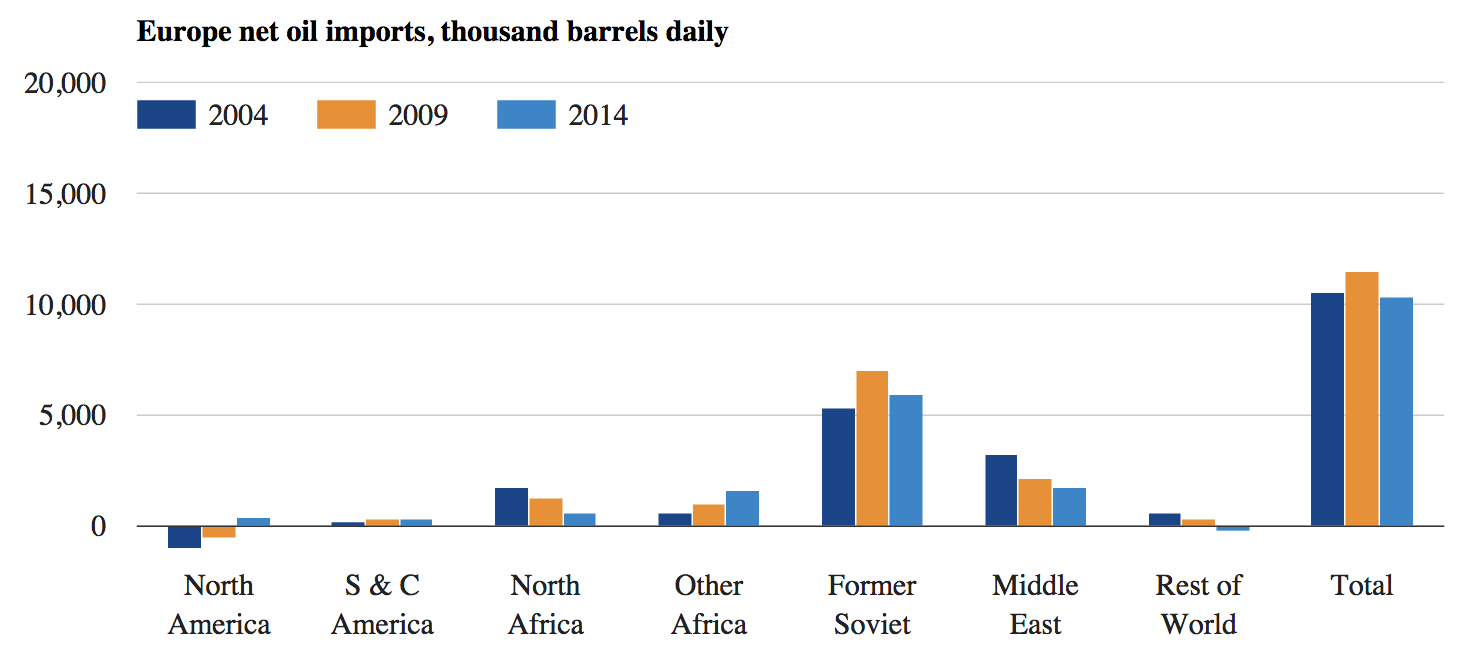
Net oil imports to Europe from its major trading partner countries and regions in 2004, 2009 and 2014 (thousands of barrels per day). Source: BP Statistical Review of World Energy 2005, 2010 and 2015. Chart by Carbon Brief.
At this point, it’s worth raising some caveats about the data behind our charts. The top two Sankey diagrams and all of the graphs stem from the BP Statistical Review of World Energy for 2005, 2010 and 2015, covering oil trade data for 2004, 2009 and 2014.
A lot has changed since 2014, not least the oil price crash that has left prices hovering around $30 a barrel. This week Saudi Arabia, Russia and others agreed to consider freezing production at current, record levels, in a first step towards rebalancing supply and demand.
In recent months, US oil production has slipped slightly as low prices hit shale producers’ profits, though, for now, it also remains at near-record levels. Meanwhile, prolonged economic uncertainty is clouding prospects for oil demand growth in China.
BP is due to publish its 2016 statistical review in June. Carbon Brief will update these charts with the new data.
OPEC data
There’s a much more detailed Sankey diagram of exports and imports, below, based on a separate set of 2014 data from OPEC, the oil producers’ cartel. (Again, this data is a little out of date, given the fast-moving events of the past year or so.)
This has the advantage of including data for many more individual countries, though it lacks information on direct trades between countries. Instead, it shows exports to, and imports from, the broad regions shown in the colour-coded world map.
The left-hand side of the diagram shows how much oil each OPEC nation exported in 2014. The destination region is in the centre. The right-hand side shows the amount of oil going to each of the region’s largest importers and which region it came from.

