In-depth Q&A: The UK Climate Projections 2018
Robert McSweeney
11.29.18Update: The article was updated on 17/09/2019 to include the new 2.2km local data published in September 2019.
At the Science Museum on Monday, environment secretary Michael Gove launched the latest set of climate change projections for the UK.
Produced by the Met Office Hadley Centre, the UK Climate Projections 2018 – or “UKCP18” – is the “most comprehensive picture yet of how the climate could change” in the UK.
It includes projections of how temperatures, rainfall, cloud cover and humidity could change in the coming decades, as well as forecasts for how far sea levels around the UK could rise.
The findings show that “all areas of the UK are projected to be warmer” by the end of the 21st century – particularly in summer months. For example, summers as hot as in 2018 could be expected every other year by the middle of the century, the projections suggest.
For sea levels, projections show the largest increases towards the south of the UK, with London “very likely” to see between 0.53m and 1.15m of sea level rise by 2100 under a high-emissions scenario.
The new set of projections give “governments, local authorities, land managers, national infrastructure bodies and other businesses an invaluable set of tools with which to assess the nature and scale of challenges, and take decisions accordingly”, said Gove in his speech.
In this in-depth Q&A, Carbon Brief delves into what information the projections provide, what they say about the UK’s future climate and how they compare to previous projections.
What is UKCP18?
UKCP18 is the latest in a series of climate change projections for the UK that stretches back more than 25 years. It is the first major update for almost 10 years, taking advantage of the latest observed data, most recent generation of international climate models, and the most up-to-date results from the Met Office’s global and regional climate models.
UKCP18 contains a set of tools for assessing how the UK’s future climate is likely to change on land and in its surrounding waters. For the first time, projections are also included for the whole globe and also for Europe. Alongside the data are a series of reports and guidance documents to helps users find and apply the information they need.
The projections cover temperature and rainfall changes – for averages and extremes – as well as more specialist variables, such as specific humidity, air pressure and cloud cover. These are available for each month and season of the year, and for different emissions scenarios and future time periods throughout this century.
"Warmer, wetter winters"
Prof Stephen Belcher, chief scientist at @metoffice, now presenting #UKCP18 pic.twitter.com/Eg1A5rhDP1
— Leo Hickman (@LeoHickman) November 26, 2018
There are also marine projections, which cover changes in sea levels, tide levels, storm surges and wave heights. For global sea level rise, the projections are available out to 2300 in recognition that sea levels will continue to rise, even after global temperatures have been stabilised.
The aim of the projections, as a whole, is to provide the means for users to establish the risks they are exposed to from a changing climate and to plan how they can adapt.
In the past, for example, UK climate projections have been used by the Department for Food and Rural Affairs (Defra) to inform coastal communities at risk from rising sea levels, by University of Durham to investigate the potential impact of climate change on health and social care systems, and by the Environment Agency to estimate future changes in the economic impact of flooding.
What previous projections have there been?
UKCP18 is billed as the fourth set of climate projections for the UK, coming 20 years after the first projections were published as part of the UK Climate Impacts Programme (UKCIP). The aim of UKCIP was to establish “a research framework for the integrated assessment of climate change impacts in the UK” and “to underpin the development of strategies to adapt to climate change”.
However, strictly speaking, there were two earlier UK climate projections – published in 1991 and then 1996 by the Climate Change Impacts Review Group (CCIRG) of the-then Department of Environment. These very early projections used just one emissions scenario and included forecasts for seasonal temperature and precipitation.
The 1998 projections, known as “UKCIP98”, were the first to cover a range of emissions scenarios – “low”, “medium-low”, “medium-high” and “high” – in recognition that “no single climate change scenario can adequately capture the range of possible climate futures”. The projections were also expanded to cover a range of climate variables over land and marine areas.
UKCIP98 was commissioned by Defra and prepared by the Met Office Hadley Centre and the Climatic Research Unit at the University of East Anglia.
The 1998 projections were superseded by UKCIP02 (pdf) four years later. The updated projections were in the same mould as their predecessor, but took advantage of several advances in climate science understanding and modelling that had been summarised in the Intergovernmental Panel on Climate Change’s (IPCC) third assessment report in 2001.
Among the key improvements was the level of detail that climate models could simulate across the UK. This is known as “spatial resolution” and is represented by the size of the “grid cells” that the model divides the UK up into – with the model calculating the average climate within each cell.
UKCIP98 had a resolution of around 300km, which meant the UK was represented in climate models by just six grid cells. The UKCIP98 maps below, for example, show the projections for average temperature in the 2020s, 2050s and 2080s under a “medium-high” emissions scenario.
(Note: these projections were made with respect to a 1961-90 baseline. Add 0.31C to them to convert to a projection of average temperature increase since pre-industrial times.)
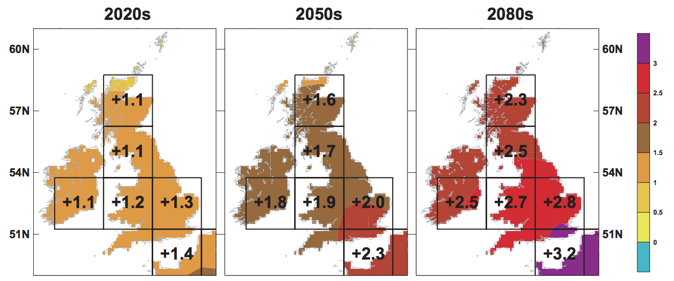
UKCIP98 projections of change in average annual temperature (in degrees C, relative to a 1961-90 baseline) for thirty-year periods centred on the 2020s (left), 2050s (middle) and 2080s (right) for a medium-high emissions scenario. The highlighted numbers show the change for each model land gridbox over the UK. Source: Hulme & Jenkins (1998)
The resolution of UKCIP02 was increased to 50km, upping the number of grid cells over the UK to 104, as the maps below of annual average temperature under a “medium-high” scenario illustrate.
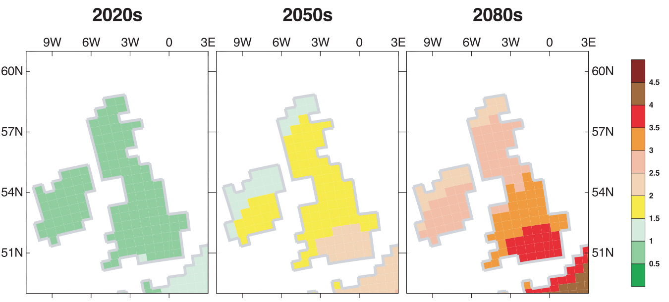
UKCIP02 projections of change in annual average temperature (in degrees C, relative to a 1961-90 baseline) for thirty-year periods centred on the 2020s (left), 2050s (middle) and 2080s (right) for a “medium-high” emissions scenario (equivalent to SRES A2). Source: Hulme et al. (2002)
The other upgrade for UKCIP02 was in the emissions scenarios it used. UKCIP02 adopted the “SRES” scenarios developed for the IPCC, which were named after the “Special Report on Emissions Scenarios“ published in 2000. SRES provided a new set of standardised scenarios for climate change modellers across the world to use.
While the SRES scenarios were also used in the UK Climate Projections 2009 seven years later, “UKCP09” otherwise provided a step change in the information the projections provided. For the first time, the forecasts were “probabilistic”, meaning each projection had a likelihood attached to it.
Both UKCIP98 and UKCIP02 provided just a single projection for each emissions scenario. So, for example, users wanting to know the likely change in average temperature by, say, the 2050s would see four potential futures. This did not give an indication of how certain each projection was.
By the time UKCP09 was in conception, it had become common practice in climate change impact assessments to use projections from more than one climate model to account for this additional uncertainty. The Met Office took this “ensemble” modelling approach a step further, using not just a handful of different models projections, but creating a collection of “runs”, each with its own variation on the model. This was large enough to allow them to calculate “probabilistic” projections where each forecasted change in climate is accompanied by a relative likelihood of that future occurring based on the evidence available.
The maps below show how the single projection for summer temperature in the 2080s under a high emissions scenario in UKCIP02 (far left map) compares with the range of possible outcomes in UKCP09.
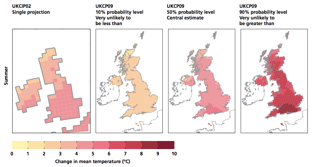
Comparison of projected changes in average summer temperature by the 2080s under a high emissions scenarios, from the UKCIP02 report (far left map) and as projected in UKCP09 at 10, 50 and 90% probability levels, relative to a 1961-90 baseline. Source: Jenkins et al. (2009)
UKCP09 also further increased the spatial resolution of the projections, taking the grid cell size down to 25km, which is equivalent to 440 grid cells over the UK. The projections were also produced for administrative regions, river basins and marine regions around the UK.
These were available for each month and season, as well as for seven future time periods, rather than just three as in UKCIP98 and UKCIP02.
What is new in UKCP18?
The “wheel” below shows the main products that UKCP18 provides. This includes a mix of elements that have been updated since UKCP09 and those that are included for the first time.
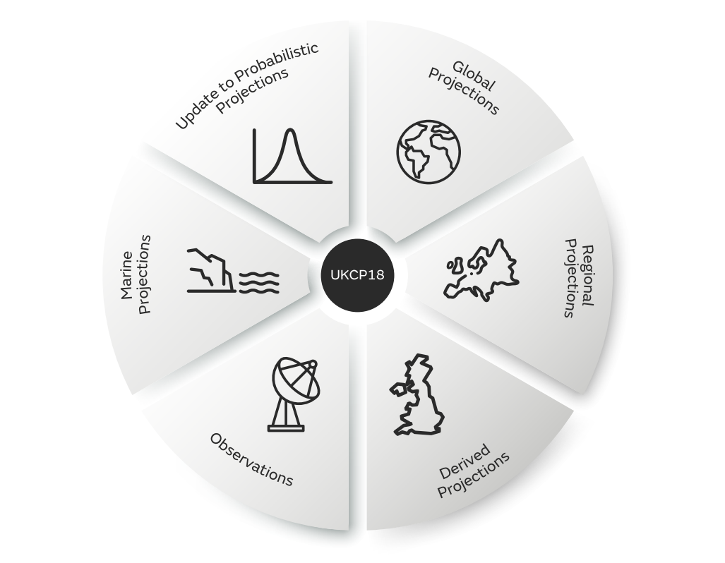
Infographic of UKCP18 “wheel” showing the products it provides. Source: Lowe et al. (2018)
Starting in the top-left and working clockwise around the wheel, the central product of UKCP18 – as with UKCP09 – is the probabilistic projections over land. These have been improved in several different ways, says Prof Jason Lowe, head of climate services at the Met Office Hadley Centre and “lead supplier” for UKCP18. Speaking to Carbon Brief after the UKCP18 launch event, Lowe explained:
“We’ve improved them, for instance, by incorporating more recent observations into the [model] constraints, by including more recent international models, and also by a better treatment [within the model] of the carbon cycle and land use emissions.”
![]()
Another change has been to the emissions scenarios. Since UKCP09, the SRES scenarios have been replaced by the Representative Concentration Pathways (RCPs), which were used in the most recent IPCC assessment report (“AR5”). The UKCP18 probabilistic projections use four of the RCPs – 2.6, 4.5, 6.0 and 8.5 – named after the amount of “radiative forcing” they cause by the end of the century (which is the change in energy that, on balance, warms the Earth as a result of a stronger greenhouse effect). In addition, the projections have also been produced for one of the SRES scenarios (A1B) to allow direct comparison with UKCP09.
(The Met Office has produced a guide (pdf) to the RCPs and how they compare to the SRES scenarios.)![]()
As well being available for future 30-year time periods centred on a particular decade, users will be able to generate UKCP18 projections for specific years – though this feature was not available at the time of writing. The probabilistic projections are available for individual 25km grid cells across the UK as well as countries, regions and major river basins.
While previous UK climate projections used a 1961-90 baseline, UKCP18 offers several options. 1961-90 is “now out of date as a representation of recent climate”, explains the science report for the land projections (pdf), although UKCP18 does include this baseline for direct comparison with UKCP09.
The standard baseline of the World Meteorological Organisation is currently 1981-2010, which is also offered in UKCP18 for the land projections. However, the RCP emissions scenarios start from 2006, meaning the “simulations include an element of predictive information during 2001-2010”, the science report says. As a result, the standard baseline for UKCP18 – available for all land and marine projections – is 1981-2000. This is a 20-year baseline rather than 30-year to “maintain consistency across UKCP18 products”, the Met Office says (pdf), because the forthcoming high-resolution 2.2km projections (see later question) will only be available for 20-year time periods (due to limitations of computing power).
Generating projections across multiple model runs to give a probability is useful for simple risk assessments – such as the likelihood of exceeding 4C of average warming. However, more complicated impact studies relating to more than one climate variable need projections that are “physically consistent”.
For example, using a crop model to assess the impact of climate change on yields might need to consider multiple variables, such as temperature, rainfall, sunlight, humidity and wind speed. Taking projections of all variables from the same model means they are consistent with one another – in other words, that the forecasted changes in temperature, rainfall and so on could all occur in the same future world.
For these types of assessments, UKCP18 includes a wider set of global and regional projections. These started life as a set of global projections from the latest Hadley Centre global climate model along with other models from around the world that formed part of the CMIP5 project that fed into IPCC AR5.
The global projections, at 60km resolution, have also been “downscaled” to a 12km grid across the whole of Europe. In the case of UKCP18, this used the global data to drive a regional climate model, which can take into account more of the specific detail of, for example, the land surface in its simulations.
The maps below give an example of how much more detailed the 12km regional data is (right-hand map) once it has been downscaled from the 60km global model (left-hand map).
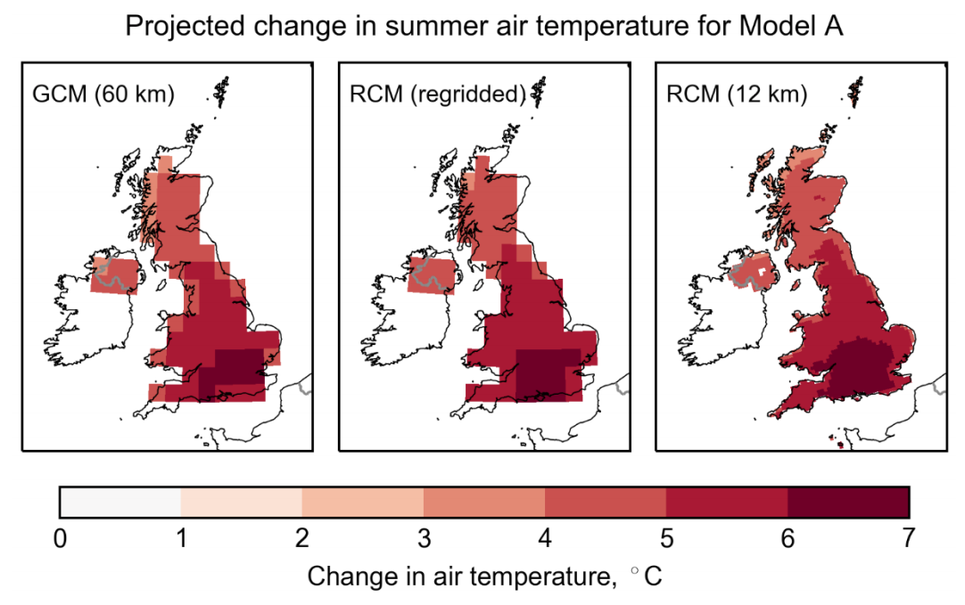
Comparison of a single global model projection (example Model A, left-hand map) and the regional climate model it drove (right-hand map) for summer temperature change from present-day to the period 2060-2080. The middle map shows the Regional Climate Model (RCM) response regridded to the Global Climate Model (GCM) grid for a clearer comparison. Source: Lowe et al. (2018)
Because the resulting data is physically and spatially consistent, the projections can be used for impact assessments covering wider areas and multiple climate variables. UKCP18 provides multiple projections for each – 28 for global and 12 for regional – to take into account the spread of uncertainty.
Such were the computing demands for these global and regional projections, they were only run for the high-emissions RCP8.5 scenario. However, the output has also been scaled to the 2C-world compatible RCP2.6 scenario for the UK only.
Finally, for the land projections, another new product in UKCP18 is a set of “derived projections”. In acknowledgement that not every user wants to work with emissions scenarios, these were produced to provide estimates of future UK climate in a world where global average temperatures are 2C or 4C above pre-industrial levels.
These temperature limits of 2C and 4C were chosen “as representative of alternative futures in the cases of strong mitigation of greenhouse gas emissions and weak or no mitigation, respectively”, the science report says. These projections are derived statistically from the global data.
While the 1.5C wasn’t included in the derived projections, “one thing we’re doing as we go forward is to look at whether we can do that for 1.5C as well”, says Prof Jason Lowe. He tells Carbon Brief:
“When we started to design UKCP18, we wanted to make sure we could pull in the models from the last IPCC assessment as part of it. The lowest RCP they ran was RCP2.6.”
In the meantime, some model runs for RCP2.6 do keep global temperature rise to the 1.5C limit by 2100, notes Lowe, so these can be pulled out directly from the model data.
Below is a summary table of the land-based projections available in UKCP18. It is worth noting that the Met Office model used for the bulk of the land projections is the latest iteration of HadGEM3 – version three of the Hadley Centre Global Environment Model. The model, referred to as “GC3.05” in the table, “produces a better representation of many aspects of European weather compared with earlier models”, the science report says, including “a better representation of storm tracks and UK precipitation variability”.
The report also notes that the rate of future warming in the GC3.05 model “is towards and above the higher end of CMIP5 models”, but is still “compatible with the statements made by the IPCC in the 5th assessment report about ranges of future warming for the RCP8.5 emission scenario”.
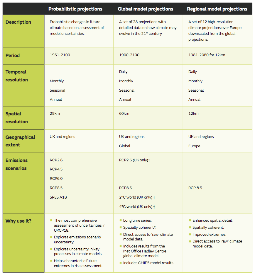
A summary of the key characteristics of each the three strands of information for the UKCP18 land projections. †Only available for the UKCP18 derived projections. *spatial coherence is important when analysing climate risks at different geographical locations at the same time, e.g. national assessments. ** A smaller set is available for RCP2.6 as some CMIP5 data is unavailable. ***Only available for Met Office Hadley Centre model. Source: Lowe et al. (2018)
As with its predecessor, UKCP18 also includes projections of future changes in the seas that surround the UK. These include projections of average sea level rise (SLR) and tides, as well as extremes, such as storm surges and wave heights.
The methods for projecting SLR broadly follows those of the IPCC AR5 report; however, they also use the latest approaches that “take better account of the growing understanding around changes in ice sheets and how they contribute to sea levels”, says Lowe.
SLR projections are provided for RCPs 2.6, 4.5 and 8.5 using the CMIP5 models. RCP6.0 was not included because it produces broadly similar sea level changes to RCP4.5, the UKCP18 marine report (pdf) says. Projections for SLR go out to 2100 and 2300, rather than just 2100 as in UKCP09.
The global SLR projections for 2100 have been “regionalised” for the UK coastline, meaning that they take into account factors that affect regional and local sea levels, such as the ongoing rebound in the height of the land surface that was covered by massive ice sheets in the last ice age (“glacial isostatic adjustment”). The graphic below highlights some of these factors.
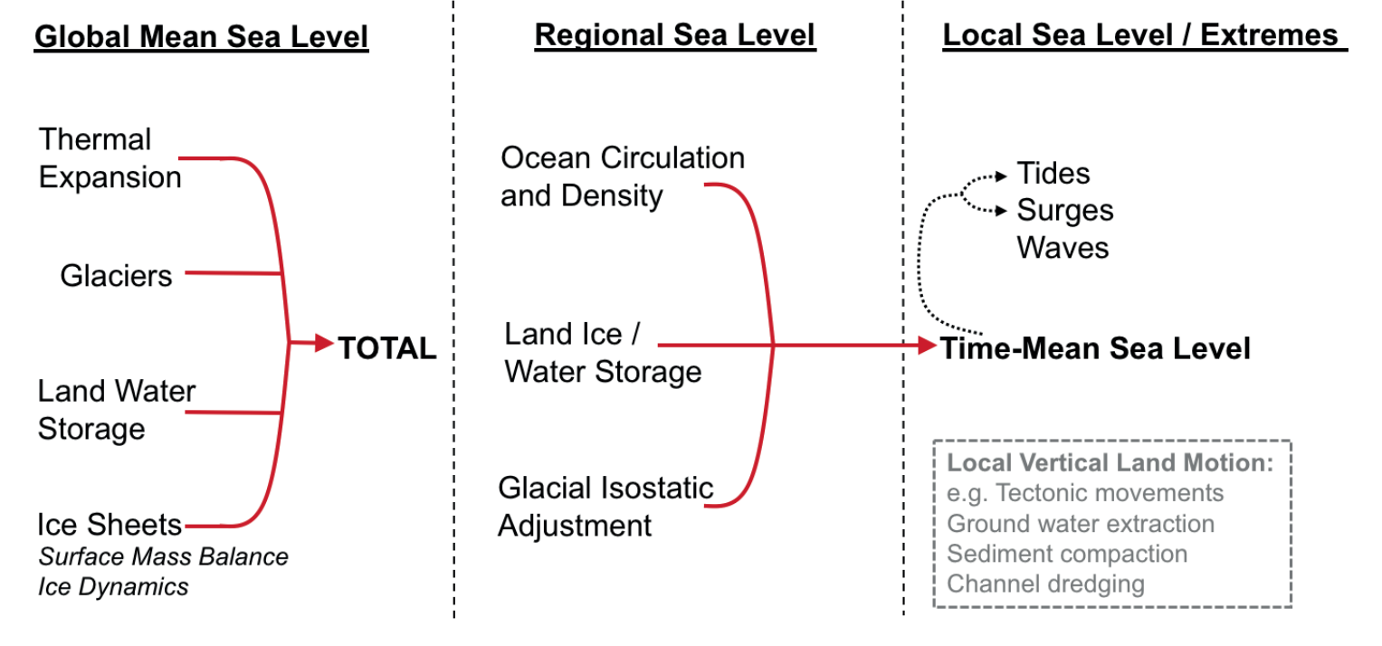
The various components that are represented in the UKCP18 sea level projections, including the major contributors to changes in global (left), regional (middle), and local (right) sea levels. The grey text highlights some of the non-climatic processes are not included UKCP18. Source: Palmer et al. (2018)
For storm surges – where sea levels experience an additional, temporary rise caused by a low-pressure storm weather system – the modelling has been expanded from just one model in UKCP09 to a collection of six models in UKCP18. Storm surge data is only available for RCP8.5.
As with the SLR projections, the storm surge data has been produced for 12km grid cells around the UK’s coastline. The table below summarises the sea level and storm surge data that UKCP18 provides.
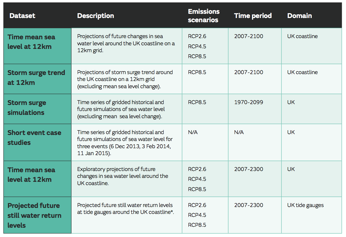
Summary table of data available from UKCP18 marine projections. The annual time-mean sea level here is the average height of the sea over a year, with the shorter-term variations of tides and storm surges averaged out. Source: Met Office
Finally, UKCP18 also includes the latest observations of climate change in the UK, which will be updated on an annual basis through the Met Office State of the UK Climate reports.
What do the land projections show?
The general conclusions of UKCP18 are similar to that of UKCP09, namely that the UK’s climate will shift “towards warmer, wetter winters and hotter, drier summers”, the Met Office says.
Certain patterns emerge from the projections, such as a noticeable north-south contrast – with greater increases in temperatures in the south in summer – and also a larger warming in summer than in winter.
The maps below show the probabilistic projections for summer average temperature in the 2080s under RCP2.6 (upper maps) and RCP8.5 (lower maps), relative to a baseline of 1961-90. The three percentiles (10th, 50th and 90th) reflect the likelihood of those temperatures occurring under that emissions scenario. The 50th percentile (middle maps) is the “central estimate” across the models, while the 10th (left) and 90th (right) percentiles reflect the lowest 10% and highest 10% of the model results.
So, for example, in London during summer under RCP8.5, there is a 10% likelihood that the increase in average temperature will be lower than around 3C, a 50% likelihood it will be higher or lower than 5-6C, and 10% likelihood that it exceeds approximately 8C.
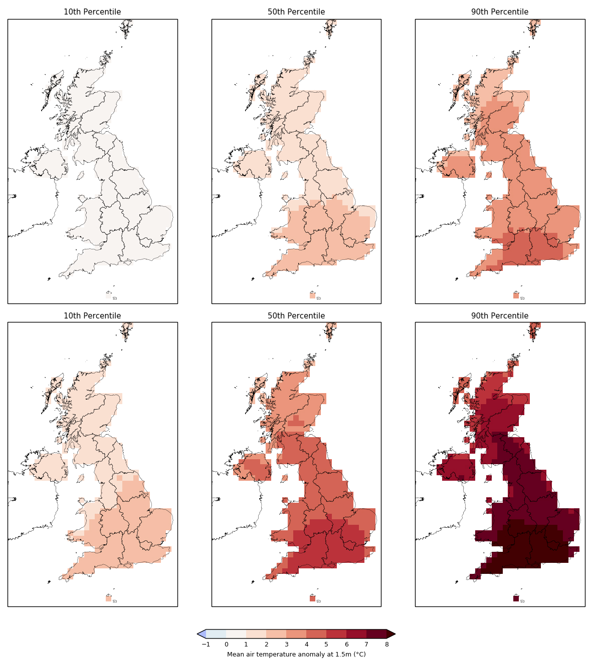
UKCP18 projections of summer (June-July-August) average temperature in the 2080s, relative to a 1961-90 baseline, under the RCP2.6 (upper maps) and RCP8.5 emissions scenarios (lower maps). Results are shown at three percentiles: 10th (left), 50th (middle) and 90th (right). Source: Generated from the UKCP18 User Interface.
The equivalent maps, shown below, for winter show that the projected average temperature rise is smaller and more consistent across the country than for summer.
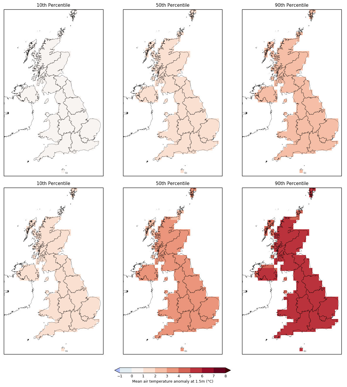
UKCP18 projections of winter (December-January-February) average temperature in the 2080s, relative to a 1961-90 baseline, under the RCP2.6 (upper maps) and RCP8.5 emissions scenarios (lower maps). Results are shown at three percentiles: 10th (left), 50th (middle) and 90th (right). Source: Generated from the UKCP18 User Interface.
In general, the projections for average rainfall show a more varied pattern. The maps below of summer average rainfall changes show the largest summer decreases in the south – particularly the southwest. Overall, the projections show “a clear shift to higher probability levels of dry summers”, says the Met Office (pdf), but with the “likelihood of individual wet summers reduces only slightly”.
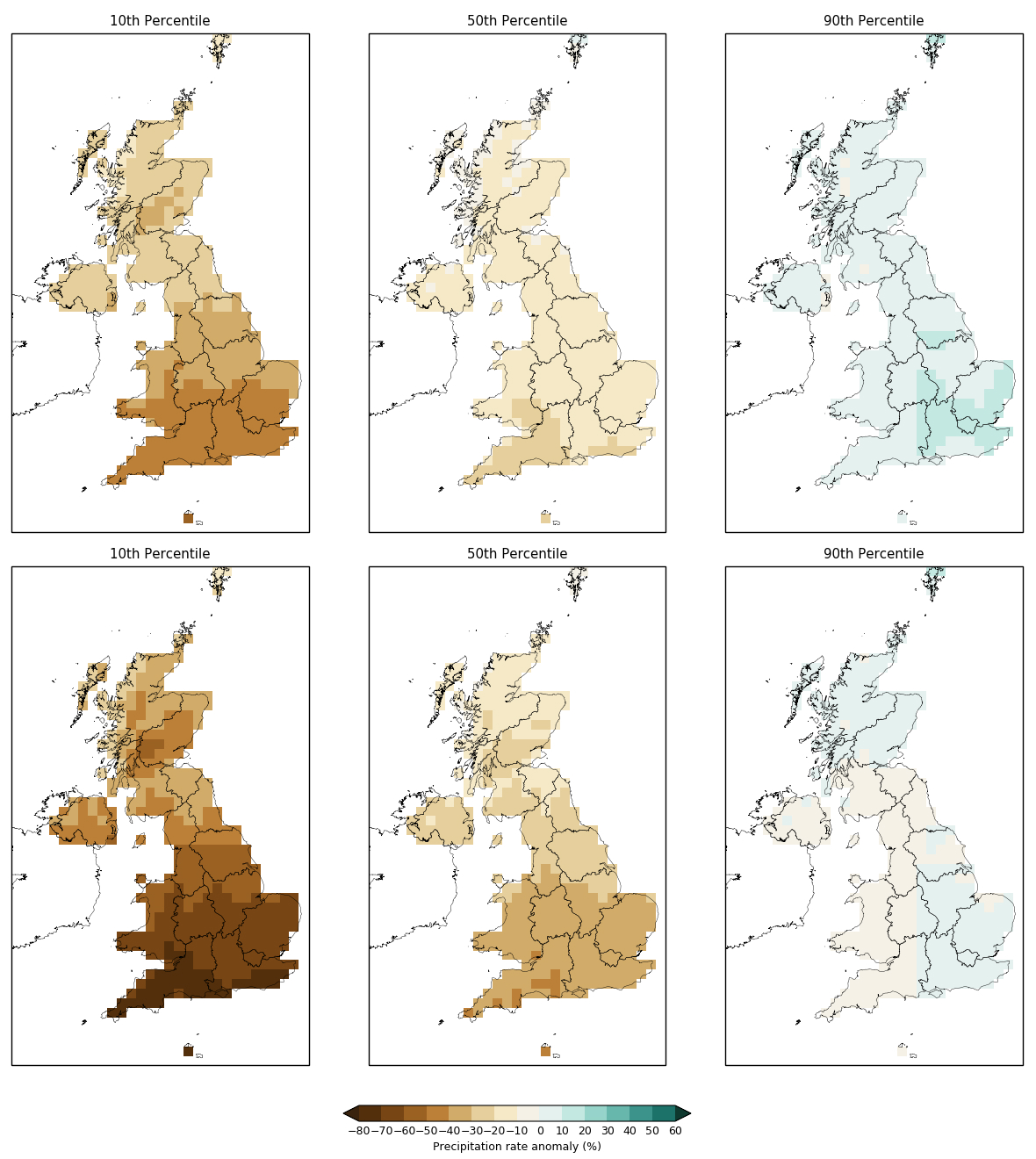
UKCP18 projections of summer (June-July-August) average precipitation in the 2080s, relative to a 1961-90 baseline, under the RCP2.6 (upper maps) and RCP8.5 emissions scenarios (lower maps). Results are shown at three percentiles: 10th (left), 50th (middle) and 90th (right). Source: Generated from the UKCP18 User Interface.
The projections for winter rainfall, below, show a more consistent increase across the country, with the largest increases around the coast – particularly in the very north and very south of the UK.
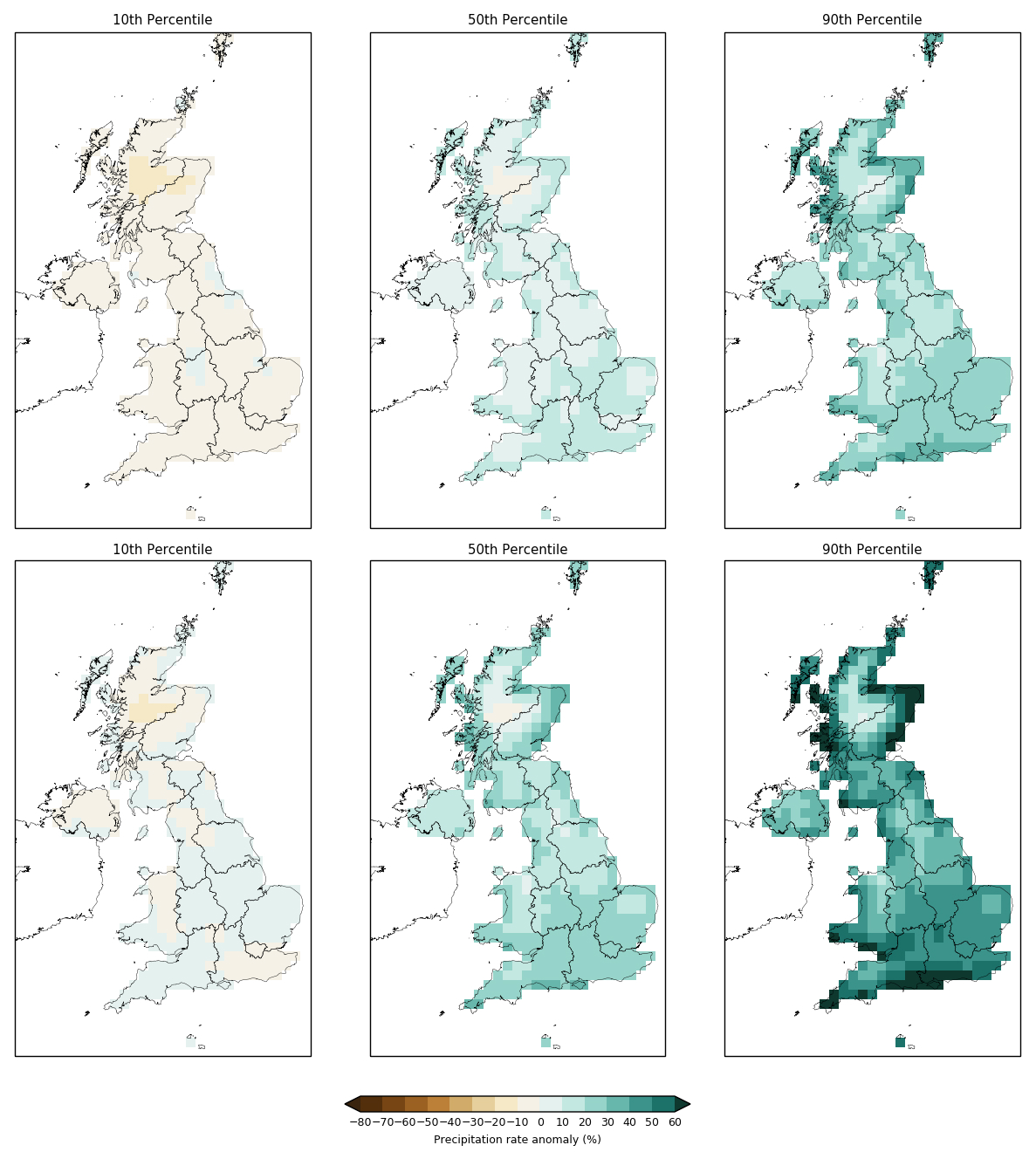
UKCP18 projections of winter (December-January-February) average precipitation in the 2080s, relative to a 1961-90 baseline, under the RCP2.6 (upper maps) and RCP8.5 emissions scenarios (lower maps). Results are shown at three percentiles: 10th (left), 50th (middle) and 90th (right). Source: Generated from the UKCP18 User Interface.
What do the marine projections show?
The table below shows SLR projections from UKCP18 throughout the 21st century for the capital cities of the UK’s four nations, all relative to a 1981-2000 baseline.
The projections suggest larger increases in relative sea level rise in the south than the north. For example, the RCP2.6 estimates for 2100 in London (0.70m) and Cardiff (0.69m) are noticeably higher than for Edinburgh (0.49m) and Belfast (0.52m).
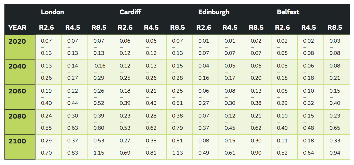
Projected ranges (from 5th to 95th percentiles) of sea level rise at UK capital cities under RCP2.6, RCP4.5 and RCP8.5, relative to a baseline period of 1981-2000. Source: Palmer et al. (2018)
This pattern is also seen in maps around the whole UK coastline, shown below. These present SLR projections under RCP2.6 (top), RCP4.5 (middle) and RCP8.5 (bottom), with the areas of largest increase shaded in yellow. The corresponding charts show UK average SLR under each RCP through the 21st century.
As discussed earlier, these north-south differences are a result of the various factors that influence sea levels at regional and local scales, such as ocean circulation patterns.
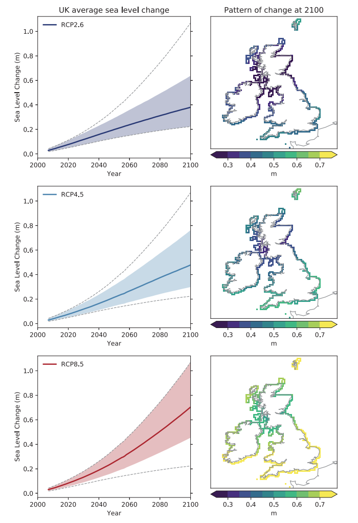
Left-hand charts show time series of sea level change as an average of main port locations around the UK for RCP2.6 (top), RCP4.5 (middle) and RCP8.5 (bottom). The solid line and shaded regions represent the central estimate and ranges for each RCP. The dashed lines indicate the overall range across RCP scenarios. The right-hand maps show the spatial pattern of change at 2100 associated with the central estimate of each RCP scenario. All projections are relative to a baseline period of 1981-2000. Source: Palmer et al. (2018)
Is UKCP18 peer-reviewed?
UKCP18 was overseen by an “independent peer review panel” made up of 11 climate scientists (six from the UK, four from Europe and one from the US), explains the Met Office. The panel was chaired by Sir Brian Hoskins, director of the Grantham Institute for Climate Change at Imperial College London and professor of meteorology at the University of Reading. The panel members were reviewed and agreed by Prof Ian Boyd, the chief scientific advisor to Defra, and the Defra Science Advisory Council.
The purpose of this panel was to review and comment on scientific aspects of UKCP18 – from the original work plan through to the final reports and guidance documents. The Met Office has published (pdf) all the review comments and replies from the peer-review process.
The Met Office has also produced an infographic explaining the UKCP18 peer-review process.
Developing UKCP18 also involved two “user groups” (pdf) to provide input and feedback. The “government” user group was chaired by Kathryn Brown, head of adaptation at the Committee on Climate Change, while the “non-government” user group was chaired by Dr Harriet Orr, a research expert in climate change at the Environment Agency.
The peer-review panel, user groups and the UKCP18 team itself all reported into the UKCP18 governance board, which had “overall responsibility for the delivery of the project”. This was made up of “senior representatives from the Met Office, Environment Agency, BEIS [Department for Business, Energy and Industrial Strategy], Devolved Administrations, Adaptations Sub Committee and the UKCP18 Peer Review Panel”. It was chaired by Prof Ian Boyd.
How do the UKCP18 projections compare to UKCP09?
As mentioned earlier, while UKCP18 projections use different emissions scenarios from UKCP09, they were also run for the SRES A1B “medium” scenario to allow a direct comparison between the two.
In general, the projections produced in UKCP18 have “a large amount of overlap” with UKCP09, explains Lowe:
“When we look at the headline projections from the probabilistic product, the first thing we see is that headline message of warmer, wetter winters and drier summers – that’s consistent with UKCP09.”
This means that UKCP18 “is adding confidence to what what was produced in UKCP09”, says Lowe. However, as to be expected, there are differences between the projections. The largest are in winter, the UKCP18 Science Overview report notes, with the UKCP18 having “slightly less warming for the same common scenario in winter for South East England”, for example.
The maps below compare the central estimates for UKCP09 (left) and UKCP18 (right) for summer (first set of maps) and winter (second set) average temperature. All maps used the 2080s time period and the A1B emissions scenario.
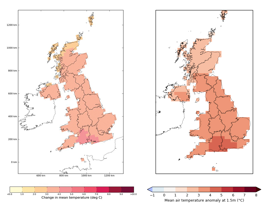
Central projection (50th percentile) of summer (June-July-August) average temperature for UKCP09 (left) and UKCP18 (right) for the A1B emissions scenario for the 2080s. Source: Generated from the UKCP09 User Interface and the UKCP18 User Interface.
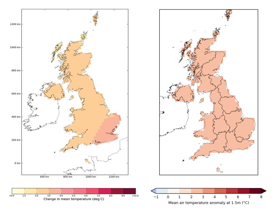
Central projection (50th percentile) of winter (December-January-February) average temperature for UKCP09 (left) and UKCP18 (right) for the A1B emissions scenario for the 2080s. Source: Generated from the UKCP09 User Interface and the UKCP18 User Interface.
For rainfall, the differences are most evident at the lower likelihood end of the probabilistic projections, the report says. For example, UKCP18 shows “slightly larger reductions in precipitation” for summer and autumn and “slightly smaller increases” for winter and spring.
The maps below compare the central estimates for UKCP09 (left) and UKCP18 (right) for summer (first set of maps) and winter (second set) rainfall – again using the 2080s time period and the A1B emissions scenario.
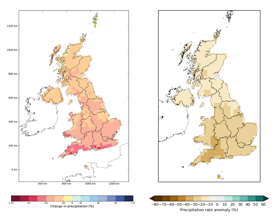
Central projection (50th percentile) of summer (June-July-August) average rainfall for UKCP09 (left) and UKCP18 (right) for the A1B emissions scenario for the 2080s. Source: Generated from the UKCP09 User Interface and the UKCP18 User Interface.
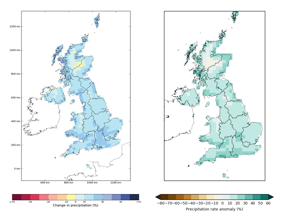
Central projection (50th percentile) of winter (December-January-February) average rainfall for UKCP09 (left) and UKCP18 (right) for the A1B emissions scenario for the 2080s. Source: Generated from the UKCP09 User Interface and the UKCP18 User Interface.
For the marine projections, the UKCP18 sea level projections “are consistently larger than in the previous set of UK climate projections, UKCP09, for similar emissions scenarios”, says the Met Office (pdf), but also UKCP18 also includes a lower emissions scenario (RCP2.6) that assumes more mitigation.
The larger SLR projections are a result of the “inclusion of ice dynamics” from the Antarctic ice sheet in UKCP18, the Marine Report notes (pdf). The methods used in UKCP18 are based on a 2014 paper in Earth System Dynamics on projecting ice discharge from Antarctica.
The difference that this makes can be seen in the charts below, which show the SLR projections out to 2100 for London (top) and Edinburgh (bottom) for UKCP18 (left) and UKCP09 (right). The bold lines show the central estimate for each emissions scenario, while the dotted lines show the full range in the projections.

SLR projections for London and Edinburgh from UKCP09 (left) and UKCP18 (right). UKCP18 results are relative to a baseline of 1981-2000, while UKCP09 results are relative to a baseline of 1980-1999 (note that difference in baseline period equates to 1-2 mm). The solid lines indicate the central estimate and dashed lines indicate the range for each scenario as indicated in the legend. Source: Palmer et al. (2018)
How can the projections be accessed?
There are various ways to access the projections within UKCP18. At the simplest level, the key information is available on the Met Office website. This includes the “headline findings” (pdf) of UKCP18, a set of six “demonstration projects” that show how the projections can be applied in practise, and an “image selector” that shows maps of projections on land for different climate variables, emissions scenarios and timeslices.
The Met Office website also hosts extensive guidance and technical reports for the land projections (pdf), marine projections (pdf) and the “derived projections” (pdf) at different temperature levels. Some information, such as the “frequently asked questions” page, is “coming soon”.
At the next level up there is the UKCP18 User Interface. This is where the bulk of the UKCP18 products can be found. The UI requires registration, but is free to use.
The aim of the interface is to guide users through all the various products to find what they need. Users first employ the filter to narrow down which UKCP18 product they want to use – such as a maps of probabilistic projections on land, or a plume plot of sea level rise projections. They they “submit a request” of their specific requirements, filling in a series of tick boxes to select the climate variable, timeslice, region, baseline period and emissions scenario of choice. Once complete, the resulting data can be downloaded from the “My Jobs” page of the interface.
There’s also a Helpdesk for any queries on UKCP18 or the User Interface.
Finally, at the most detailed level, the raw data for all of the UKCP18 projections can be downloaded – for free – from the Centre for Environmental Data Analysis (CEDA) website. The Met Office has produced a guidance document (pdf) on the types of data available, their formats and how to access them.
What about the local 2.2km data that was published later?
UKCP18 is an ongoing project with a number of planned additional products. Perhaps the most significant of these is a set of projections at an even higher resolution – using a grid cell size of just 2.2km across the UK. This “local” data was launched at an event in London on 16 September 2019.
These projections are produced using the Met Office Hadley Centre’s new 2.2km “Convection-Permitting” Model (CPM), which itself is based on the Met Office’s operational “kilometre-scale” Unified Model (“UKV”) used for weather forecasts. The model is “convection-permitting” because the high resolution allows the model to simulate some of the small-scale processes in the atmosphere, such as the large convective weather storms that are associated with summer thunderstorms and torrential downpours. Lower resolution models typically have to simplify these processes through a process called “parameterisation”.
This 2.2km data – along with the daily data provided by the UKCP18 global and regional climate model projections – essentially replaces the UKCP09 weather generator, which allowed users to generate daily and hourly time series of various weather variables at 5km resolution.
Introducing the new local projections, Prof Sir Ian Boyd, former chief scientific adviser at the Department of Environment, Food and Rural Affairs, said they are “breaking new ground” in being able to research high-risk events.
Met Office climate scientist Dr Lizzie Kendon – introduced by Boyd as the “brains” behind the 2.2km projections – explained that “this is the first time anywhere internationally that we have been able to provide national climate scenarios at a resolution on par with weather forecasting”. (Kendon has previously written a guest article for Carbon Brief about the development of high-resolution climate projections.)
As the figure below illustrates, providing data at the 2.2km grid scale – as opposed to 60km for the global data and 12km for the regional – means the projections can better represent small-scale features of the UK. This includes mountains, coastlines and urban areas, for example.

Resolution of UKCP climate change projections, from global at 60km (left), through to regional at 12km (middle) and local at 2.2km (right). Source: Met Office (pdf)
By comparing the model against past weather events, the UKCP team found that the 2.2km model “better simulates several aspects of present-day climate” than the regional model. For example, they found that it improved model representation of the daily cycle of rainfall over the year (pdf) as well as cold winter days and the number of intense cold spells in northern parts of the country.
For example, the local data “gives an improved representation of local soil moisture, which may impact the severity of high temperature events in local areas”, the Met Office says (pdf). So, in the example below of a heatwave, the 2.2km data reveals that temperatures in very localised areas might get even higher than projected in the regional data.
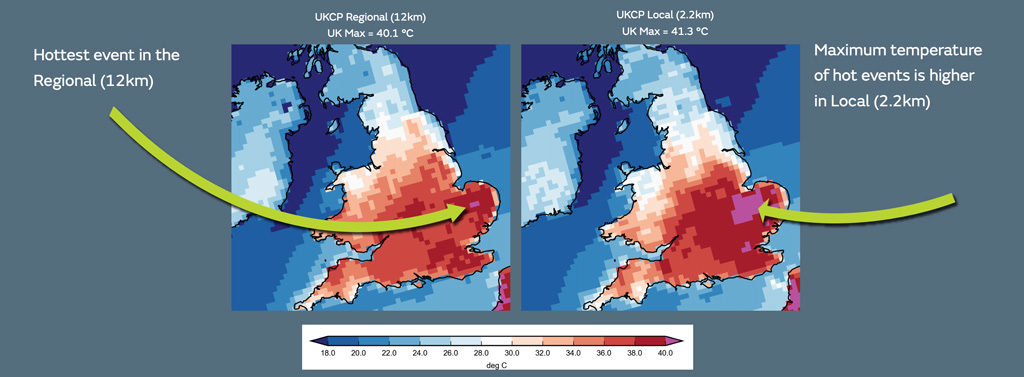
Example of hottest hourly temperature that occurs in the baseline period (1981-2000) for the regional model (left) and the local model (right). Temperatures above 40C are indicated by pink shading. Source: Met Office (pdf)
Overall, the higher level of detail allows scientists to “describe extremes of weather for your local area over the coming decades”, says Kendon. This can be used for planning and decision-making – for example, designing sewers with the capacity for heavier rainfall events or designing an office building to cope with future heat extremes in a city.
The local data “do not change the UKCP18 headline message of a greater chance of warmer wetter winters and hotter drier summers across the UK in future”, the non-technical summary (pdf) says. However, as the figure below shows, the 2.2km data do provide new information specific seasonal and local changes, as well as extreme weather.
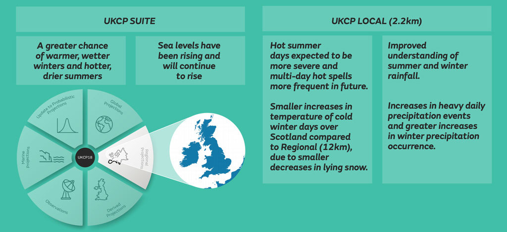
Headline messages of the UKCP projections as a whole (left) and specifically for the local 2.2km data (right). Source: Met Office (pdf)
The local data are only available for the high-emissions RCP8.5 scenario. This was a “deliberate decision”, says Kendon, “because it is really important for us to be able to disentangle the underlying climate change signal from the vagaries of the British climate”.
In other words, because global temperature rise is more prominent in a high-emission scenario such as RCP8.5, it is easier for scientists to isolate the climate change signal in model simulations. Scientists can then use scaling techniques to “track back” for “nearer time horizons and also for different emissions scenarios”, says Kendon. “It is also important for us to understand what a high-emissions scenario would look like – if we’re interested in trying to plan for future climate change,” she adds.
The local data is available for a baseline 1981-2000 period as well as time periods in the first and second half of the century – 2021-40 and 2061-80, respectively.
It should also be noted that the set of 12 local projections are “downscaled” from a set of 15 model runs of the Met Office’s HadGEM3 model over the UK and Europe. This means they are based on a single model and so cover a narrower spread of potential futures than the UKCP18 global data, which includes 13 other climate models from CMIP5.
The table below shows how the 2.2km data will sit alongside the other land-based projections.
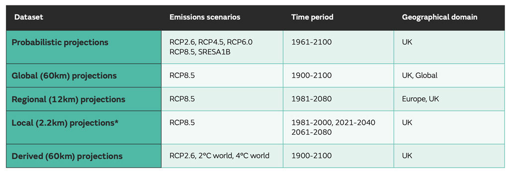
Summary of projections and scenarios for land projection products. Source: Met Office (pdf)
More information about the local data can be found in the full science report (pdf) and a dedicated factsheet (pdf) that includes a table to help users decide which level of data (global, regional or local) is more appropriate for their needs.
What did the media say about it?
The launch of UKCP18 on Monday prompted extensive coverage across the UK media. Many articles led with the projections for UK summers, which suggest “that under the highest emissions scenario, summer temperatures could be 5.4C hotter by 2070”, reported BBC News. It added: “The chances of a summer as warm as 2018 are around 50% by 2050.”
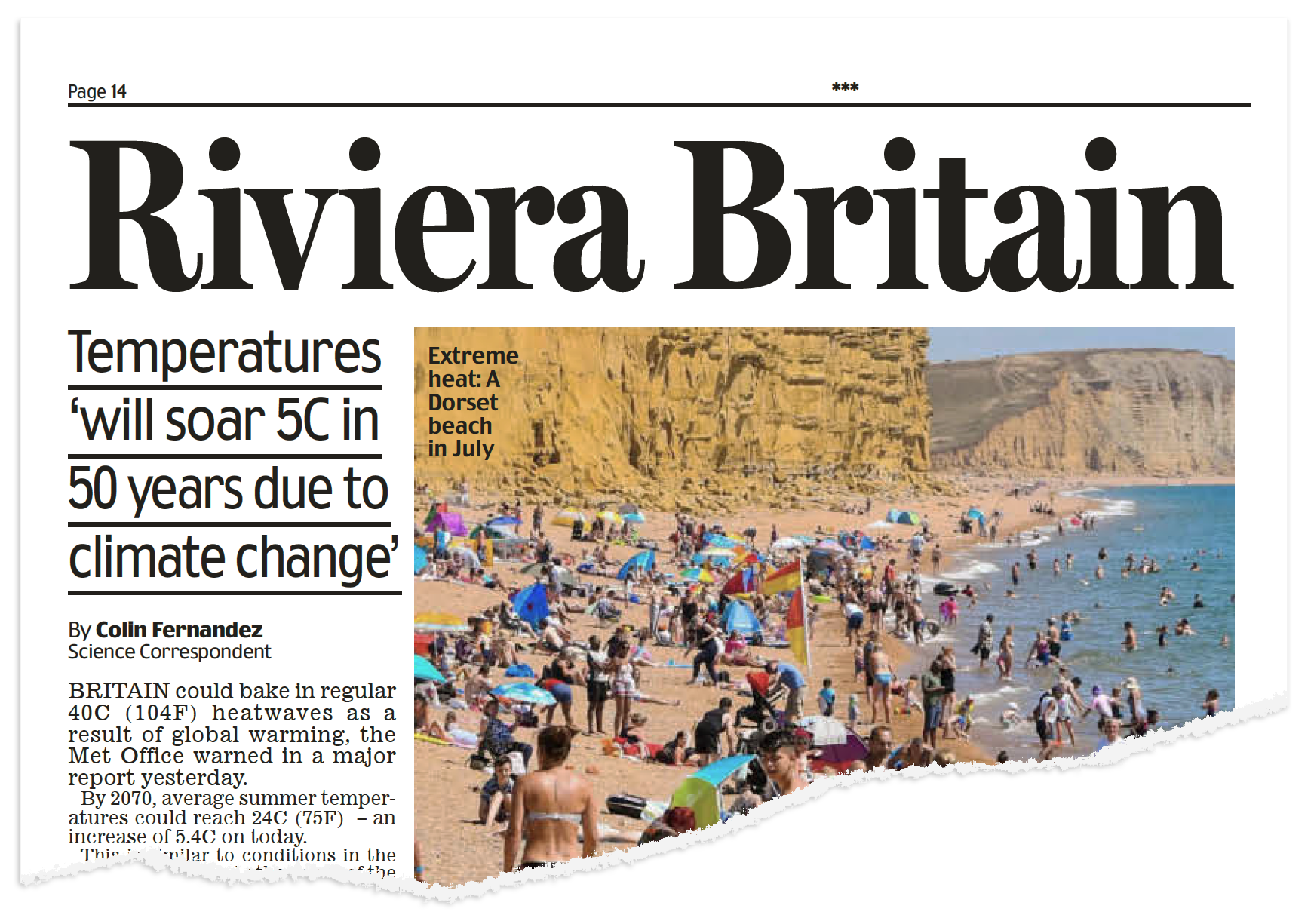
The Daily Mail chose to headline its print-edition coverage with the words “Riviera Britain”, while the Daily Express reported that summer temperatures will “skyrocket as climate change hits”.
The Times ran with the headline: “Boiling summers normal in decades, Met Office warns.” Its report continued:
“Summer heatwaves as sweltering as this year’s could become the norm within 50 years…The most detailed forecast yet of the probable impact of global warming described boiling summers, falling crop yields and rising sea levels that the government said could force communities to ‘move out of harm’s way’.”
Reuters picked up on the combination of different potential impacts of climate change, noting that the UK “is likely to experience hotter, drier summers and warmer, wetter winters by the 2070s, as well as rising sea levels which can lead to floods”.
The Guardian led with how “people may have to be moved away from high-risk areas as climate change makes flooding more likely and more severe in the UK”, while the Mirror reported that “the Met Office anticipates farms could turn to marshland” and that “climate change and rising sea levels to threaten 1.5m homes”.
The Daily Telegraph approached the story from another angle, focusing on how glacial isostatic adjustment helps to limit relative SLR. Its story – headlined: “Why the last Ice Age is protecting half of Britain from climate change” – explained to its readers:
“A new report setting out the expected impact for the UK as the climate warms, has found that areas squashed down by the huge ice sheets that covered northern regions until 11,700 years ago are now rebounding with sufficient vigour to protect them from sea level rise.”
The Independent highlighted the speech made by environment secretary Michael Gove at the report’s launch: “In his first major speech on climate change, Mr Gove – who famously claimed the public has ‘had enough of experts’ in relation to Brexit – backed the scientists behind the projections.” BusinessGreen published the full transcript of Gove’s speech.


