Roz Pidcock
18.11.2014 | 12:45pmEarlier this month, the Intergovernmental Panel on Climate Change (IPCC) released a major new report, summarising scientific knowledge on climate change.
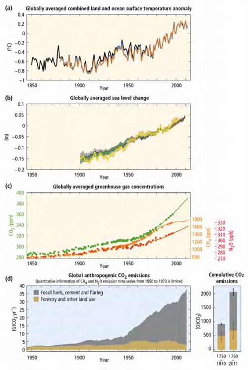
It contained something of a milestone in IPCC history – a chart linking greenhouse gas concentrations to fossil fuel emissions, rising global temperatures and sea level.
That might sound fairly innocuous. But some countries argued against its inclusion. So why was a figure outlining the well-understood link between carbon dioxide and climate change contentious?
Connecting the dots
The new figure charts the growth of atmospheric greenhouse gases over the industrial period, alongside rising emissions from fossil fuels and changes in global temperature and sea levels.

Piers Forster, professor of climate science at Leeds University and co-creator of the new chart, explains what it shows:
“The global surface temperature record (Panel a) and sea-level record (Panel b) are the longest and most certain records we have that the world has been warming. Likewise, we are confident the increase in greenhouse gases (Panel c) over the industrial period is the main cause of the long-term warming we’ve seen. And we know the rise in greenhouse gases is driven by the increase in emissions of these gases from fossil fuels and land use (Panel d).”
You might not think that’s a big deal. But while previous IPCC reports talk about human activity altering earth’s climate, this is the first time climate change impacts have been so explicitly linked to greenhouse gases from past and present fossil fuel use in a single IPCC graphic.
Forster says the reason the chart was hotly debated is that it puts pressure on big emitters past and present to acknowledge their role in tackling climate change.
Due prominence
The IPCC typically deals with climate change impacts and the different ways human activity is contributing in two separate reports, so the links between cause and effect have sometimes been less clear-cut than they could be, Forster suggests.
This time around, the authors wanted to better reflect how strong the science is when it comes to understanding how our past activity is linked to present climate change.
Forster explains:
“The figure is all about historic climate change over the long term, from pre-industrial times until the present â?¦ We wanted to show the most robust observations of long-term climate change and its causes together on the same figure.”
The new chart came about after scientists involved in the IPCC’s three reports on different aspects of climate change, released over the past year, got together to write what’s called the ‘Synthesis Report’. It pulls material from all three reports together into one coherent narrative.
The new chart forms part of the Summary for Policymakers, a 40-page distillation of the full report containing just the most policy-relevant findings.
Forster suggests that the prominence given to the chart might not sit well with rich, industrialised nations, countries that have considerable fossil fuel interests or those whose ongoing development is responsible for a large chunk of current emissions. He says:
“The figure is worrisome to some as it speaks to both historic and current responsibility for climate change. For example, you can see the fossil fuel emissions dominates those from land-use. You can also see the acceleration of emissions in recent years, principally from rapid growth in China and India.”
The new chart drew heavy criticism from some camps during a week-long meeting in Copenhagen where all 195 United Nations member countries had the opportunity to dissect every word of the summary.
Over 20 hours of sometimes very heated discussion ensued, says Forster, but the chart was finally approved – accompanied by a lengthy caption explaining that the relationship between carbon dioxide and historic temperature is not completely straightforward.
At the request of some countries, additional wording was added from the longer IPCC reports to explain that other greenhouse gases and anthropogenic drivers also contribute to the warming we’ve seen since 1950, Forster says. But, he adds:
“The figure is important for understanding historic changes, it’s an important figure and it was appropriate to concentrate on carbon dioxide as the most significant driver of historic change.”
Climate responsibility
Though it was argued over, the fact that the new chart was ultimately approved by all countries under the United Nations banner is encouraging for future climate talks, says Forster:
“This experience has given me huge optimism for the climate negotiations and points the way forward. If nations accept the science and China joins the EU in both setting targets and pushing for a robust international agreement, Paris will be a huge success.”
China, which is the biggest emitter of greenhouse gases in the world, last week announced its intention to peak emissions by 2030. In a joint pledge with China, the United States committed to cutting emissions by up to 28 per cent by 2025, compared to 2005 levels.
Last week’s pledges are symbolic in breaking the impasse between industrialised and developing nations over climate responsibility. Joint accountability and collective action are important messages from the new chart, and ones that may just help to shine the spotlight on other big emitters to fall in step as we head towards Paris in 2015.

