
Factcheck: Newspaper claim about global temperature is ‘deeply misleading’
Zeke Hausfather
12.03.16Zeke Hausfather
03.12.2016 | 1:13pmThis is a guest post by Zeke Hausfather, a climate scientist and energy systems analyst at Berkeley Earth, an independent temperature analysis project.
It is all but certain now that 2016 will shatter historical records to be the warmest year ever by a wide margin. It was helped along the way by a large El Niño event, which tends to be associated with warmer temperatures globally. But, even without El Niño, 2016 would likely still be the warmest year ever. Now that the El Niño is fading, temperatures are dropping modestly down to around where they were before the El Niño started.
Recently, journalist David Rose published a deeply misleading article in the Mail on Sunday, a UK tabloid, claiming, “Global average temperatures over land have plummeted by more than 1C”.
He also argued that 2016 (and 2015) would not have been particularly warm years in the absence of El Niño, and that El Niño might be responsible for much of recent warming. These claims are incorrect. They are prefaced on cherry-picking an obscure temperature record, whose creator suggests it “should be used with caution” and which disagrees with other estimates by independent groups.
In reality, 2014, 2015 and 2016 have been the three warmest years on record not because of a large El Niño, but because of a long-term warming trend driven by human emissions of greenhouse gases.
The modest decline in temperatures in recent months from the peak of the El Niño event is completely in line with what has happened during past large El Niño events and was expected by scientists.
To better understand what’s going on with the Earth’s temperature, lets take a look at the various temperature records and what they tell us.
Global surface temperatures
We live on the surface of the Earth. It should come as no surprise that the easiest and most accurate way to measure the Earth’s surface temperature is with thermometers.
Various groups have put together long term temperature records using data from weather stations, ships, and floating ocean buoys. They largely agree, despite using differing approaches where data is lacking, and using somewhat different underlying datasets. Temperature records from five groups are shown in the figure below: NASA, NOAA, the UK’s Met Office Hadley Centre/UEA, the non-profit Berkeley Earth, and a record by independent researchers Cowtan and Way.
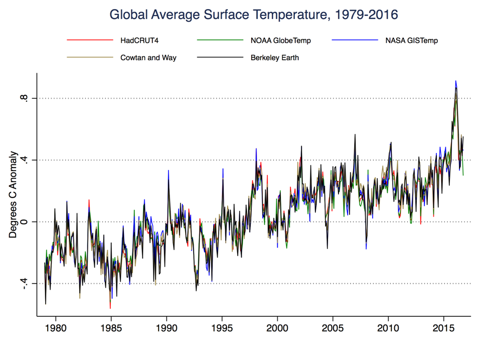
Global average surface temperature, 1979-2016
Here we can clearly see both the long-term warming trend over the past 30 years, as well as the effect of El Niño events (the small jumps up) and their sister La Niña events (the small jumps down).
The large El Niño of 2015/2016 clearly stands out, but it’s clear that the overall record is warming quickly, even without the El Niño event. In the past few months temperatures have fallen a bit from the El Niño peak, but are still quite high by historic standards.
Global tropospheric temperatures
In addition to the surface temperature record, a number of groups have attempted to put together a record of changes in atmospheric temperature using data from satellites. These satellites indirectly measure the temperature of the lower troposphere, a layer of the atmosphere about 2 miles (4 km) straight up in the sky.
These will necessarily differ a bit from surface records, since we wouldn’t expect the temperatures of the surface and miles up in the atmosphere to necessarily be identical.
Creating a reliable temperature record from satellites has proven somewhat difficult. There has not been a single satellite taking measurements since 1979; rather, new satellites are launched every few years as old satellites’ orbits decay and they fall out of the sky.
As the orbits change, the temperature readings from satellites will change a bit, and need to be adjusted. Similarly, when new satellites are launched their instruments need to be calibrated against the readings from old satellites. All of these introduce uncertainties that appear much larger than those in the surface record, as discussed in the video below:
Three groups provide satellite-based estimates of global lower tropospheric temperatures: UAH, RSS, and NOAA’s STAR. All use the same underlying satellite readings, but apply different adjustments and models to account for satellite transitions and orbital drift. The global average lower tropospheric temperatures from the three groups since 1979 are shown below:
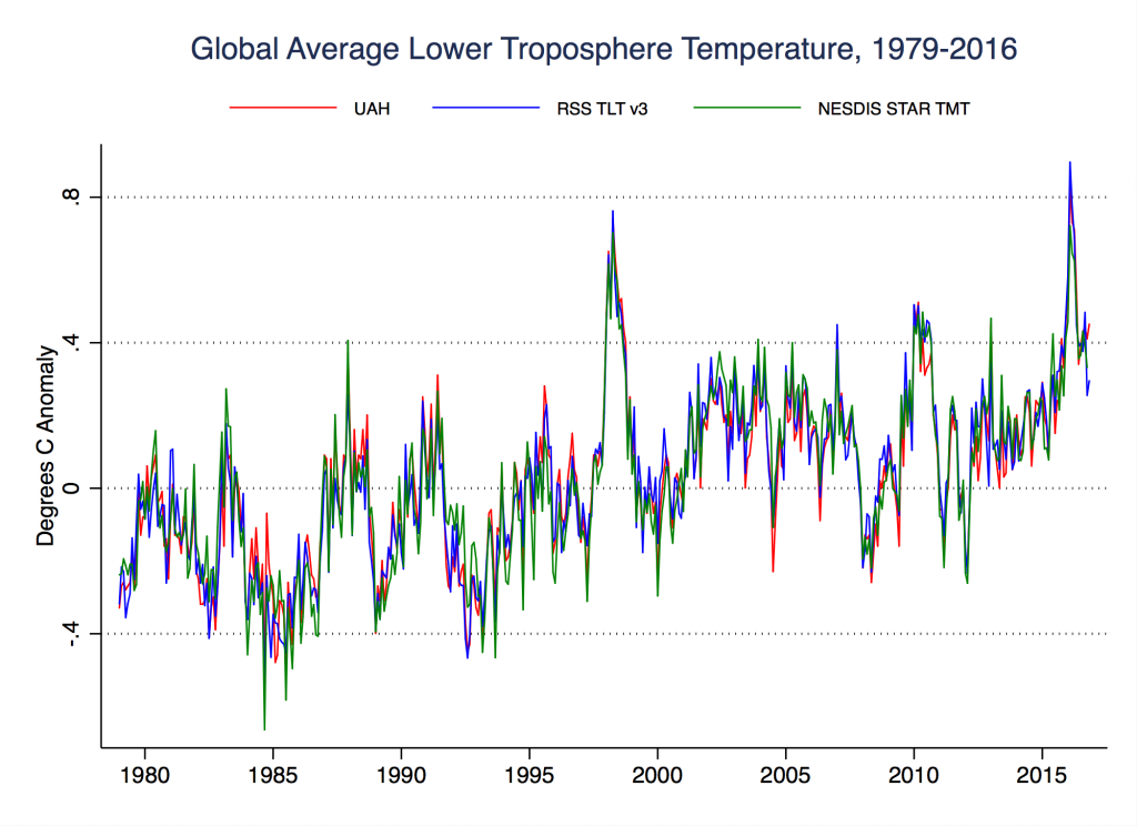
Global land-ocean lower tropospheric temperature anomalies by month, January 1979 through November 2016.
El Niño events tend to show up more prominently in tropospheric temperatures than in surface temperatures. We can see this in the figure above, where the spikes during the El Niño events (particularly the 1997/1998 event) are much larger than in the surface data. Temperatures have dropped a bit since the end of the latest El Niño event, as we saw in the surface record, but are still quite high by historic standards.
Recently one of the groups, RSS (which is the one used by David Rose in the Mail on Sunday article) identified an error in their record due to drifting measurement times that has been affecting observations in recent years. While they have updated some of their other records, their lower tropospheric record has yet to be corrected. They state on their website that the data suffers problems “with the adjustment for drifting measurement times” and “should be used with caution”.
Carl Mears, lead scientist at RSS, has also argued that the surface temperature records are more accurate than satellite-based data when trying to estimate surface temperatures.
Global tropospheric temperatures over land
Satellites have particular difficulty accurately measuring tropospheric temperatures over land. Over time, the satellites orbit drifts, resulting in measuring different locations at different times of day. Correcting for these differing observation times can be difficult, as different parts of the world will have very different day/night temperature cycles.
Over oceans these corrections are more straightforward, as the temperature difference is smaller and is fairly consistent. Over land, however, much larger uncertainties are present, and complex models are used to try and adjust for changing observation times. Which model is chosen and how it is applied can have a large impact on the resulting satellite tropospheric land temperature series.
This means that tropospheric land-only satellite-based records should be treated with caution. Unfortunately, it’s this data (which is rarely used in any scientific analysis) that David Rose chose to highlight in his article. Not global surface temperature data, which shows a normal modest decline from the recent El Niño, nor global lower tropospheric temperature data, which shows nothing out of the ordinary, nor land-only surface temperature data, which also shows no large drop. Rose chose land-only lower tropospheric temperatures to focus on.
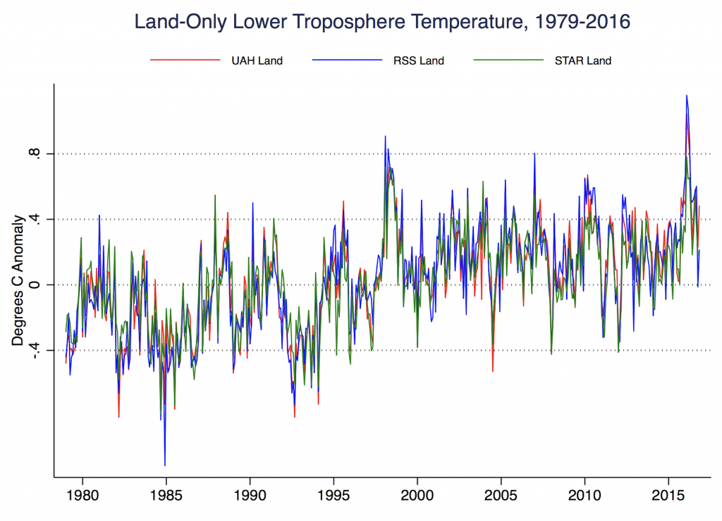
Land-only land-ocean lower tropospheric temperature anomalies by month, January 1979 through November 2016.
Land-only lower tropospheric temperature data from the three groups, UAH, RSS, NOAA STAR are shown in the figure above. Here there is less pronounced warming than in any of the other series we’ve examined, but there is also more disagreement between the records. In the last few months in particular, RSS shows a precipitous drop in temperatures not seen in the other two records. We can see this clearly if we zoom in on the past two years:
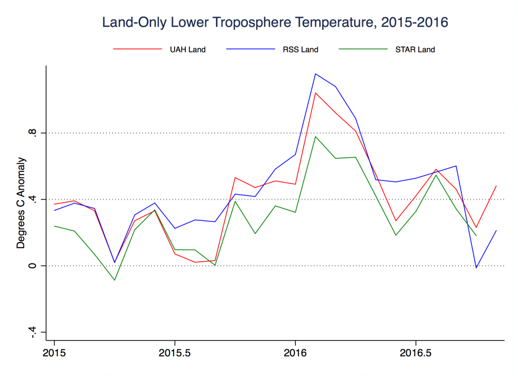
Land-only land-ocean lower tropospheric temperature anomalies by month, January 1979 through November 2016.
Here, the precipitous drop that David Rose makes such a big deal about only shows up in the RSS record. (And the very latest data, released after the Rose article was published, now shows an uptick in temperatures.) The other two records show no similar dramatic drop in recent years, just a normal decline after the El Nino event fades.
Was 2016 a record year without El Niño?
It should be clear by now that the modest decline in temperatures in the past few months is a normal reversion after the end of the El Niño event. It has relatively little impact on the longer-term warming trend, which is the most scientifically relevant metric of climate change.
However, it is possible to disentangle the effects of El Niño (and La Niña) events from the underlying warming trend, and to predict how warm it would have been in the absence of El Niño.
Scientists use a number of approaches to determine the magnitude of El Niño’s impact and remove it. An example of what temperatures would look like with El Niño removed is shown in the figure from climate scientist Chris Colose below:
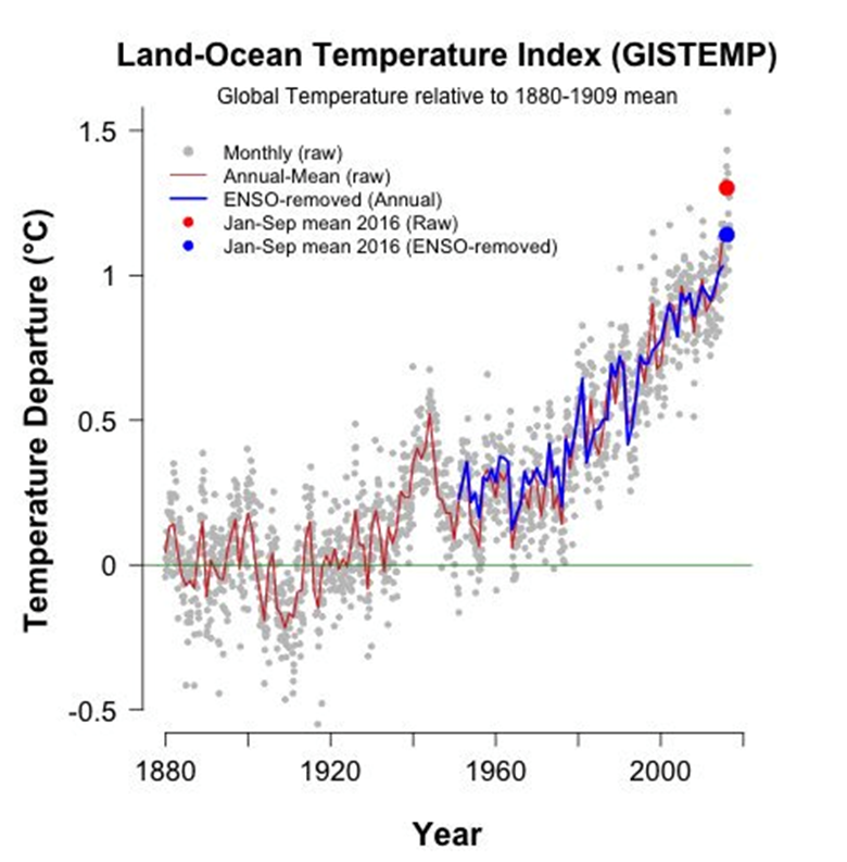
Global average surface temperature from NASA with and without the effect of El Nino/La Nina removed. Figure courtesy of Chris Colose.
Multiple researchers have found that when the effect of El Niño is removed from the surface temperature record, 2015 and 2016 remain the second hottest and hottest years, respectively. We can also try a much simpler test that doesn’t involve any complex model or statistics. Let’s take the NASA record and simply remove the El Niño spike and see what happens:
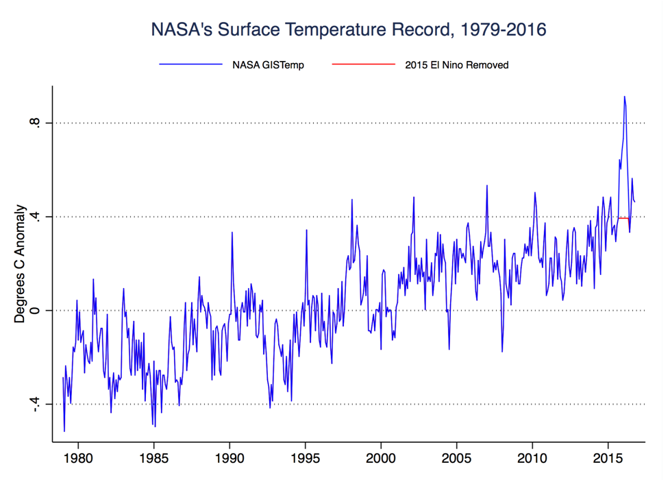
Global average surface temperature from NASA and a variant with September 2015 to May 2016 held constant.
Here the blue line represents the actual NASA surface temperature record, while the red line is a variant, where the 2015/2016 El Nino is replaced by the temperature from the month prior to its onset.
If we remove the El Niño spike, 2016 (to date) is still the hottest year on record and 2015 is still the second hottest year on record. This simple test shows that the record warmth seen in surface records in recent is best thought of as a continuation of a long term warming trend amplified (but not caused by) a large El Niño event.
-
Factcheck: Newspaper claim about global temperature is 'deeply misleading'

