Twitter has become a popular social media platform for discussing climate change. A wide range of people across the world use Twitter – scientists, politicians, campaigners, journalists, etc – to converse about the topic.
But amid the sheer volume of chatter, it’s often hard to get a top-down sense of who the most influential users are on Twitter – and where they “sit” within the Twitter “universe” compared to other users.
So Carbon Brief has commissioned Right Relevance to start harvesting data from Twitter and use it to build maps periodically showing how the influencers within the climate change conversation shift over time.
Below, John Swain from Right Relevance explains the methodology and highlights some key findings from the first wave of analysis. In the coming months, Carbon Brief will publish updated maps created by Right Relevance, as well as expand the analysis to also look at the Twitter conversation about energy issues, such as nuclear power, wind farms, solar energy, shale gas and coal.
So John begins with analysis of March 2016…
Background
At Right Relevance we provide information about influence on social media and, particularly, Twitter. We have a free service where you can discover information about topical influencers on thousands of topics. We provide an API framework to provide access to our data on influencers, which we call “Relevance as a Service”. In addition, we undertake deeper consultancy projects to provide detailed analysis of topics specifically tailored to clients needs.
I have recently blogged about Twitter influence on subjects, including the NHS, Brexit and World Economic Forum at Davos. During the COP21 climate conference in Paris last December, I blogged about the Twitter conversation that took place during the first days of the conference.
This was a period of extremely high volumes of Twitter traffic on the subject of climate change. Many world leaders were present and active on Twitter. There were approximately 600,000 tweets on the first day of the conference compared to around 200,000 per week on the subject of climate change.
The rich world must take greater responsibility for climate change…my piece in @FT. https://t.co/XiLyYK4nwI
— Narendra Modi (@narendramodi) November 30, 2015
Following the conference, Carbon Brief approached us to help develop a way to better understand the on-going Twitter conversation about the subject of climate change. For example:
- Who are the influential people and organisations within the conversation.
- What groups and topics develop within the context of the overall subject of climate change.
Working in conjunction with Carbon Brief, the object of the project was defined as follows:
So, over a period of six weeks starting at the end of February, we collected tweets covering the broad subject of climate change. We collected approximately 2 million tweets sent by 600,000 users on Twitter during this initial period. What follows is an overview of the methodology and techniques used to enable us to discover the influential users on Twitter.
I will briefly define what we mean by “influence” in the context of Twitter “conversations”, as well as show, by way of example, how we counter some of the biases inherent in any social media.
Influence
Measuring influence is not like measuring rising sea levels or air pollution. It is inherently ephemeral and subject to human cognitive bias. It is, however, a real and important phenomenon on which billions of dollars are spent annually in marketing and PR activities. It is possible to say someone is more influential than another person and give some sense of degree.
Now that we have harvested all this date, we can use various measures of influence which are calculated using methods from “Graph Theory“, which evaluate an overall conversation. These are discussed in a little more detail below. These are techniques we all use every day . For example, the famous Page Rank algorithm measures the importance of web pages and underpins the Google search engine.
So, we will use the term “influence” to describe the capacity to affect the behaviour or opinions of others. In the case of Twitter conversations, we can directly measure the behaviour of users in the number of retweets, mentions and replies to posts of other users.
We do not attempt to directly measure any effect, or influence, on the outside world, namely, the people not tweeting explicitly about climate change. However, it is possible to influence or inform people within the conversation if there is direct communication with them, which is something which we can measure.
Methodology
Conventional Twitter performance analysis uses, for example, straight-forward measures of the number of retweets, or occurrence of hashtags indicating support for a cause. These simple metrics are useful, but are subject to various problems, including abuse from spam-bot accounts, or a skewing towards users with a very large number of followers.
Graph theory is a way of correcting for these problems and gaining insight into influence within an overall subject of interest. A graph, in this context, is a representation of data which emphasises the connections between entities. This is ideal for a social network conversation on Twitter which consists of communication between users.
How to read the map
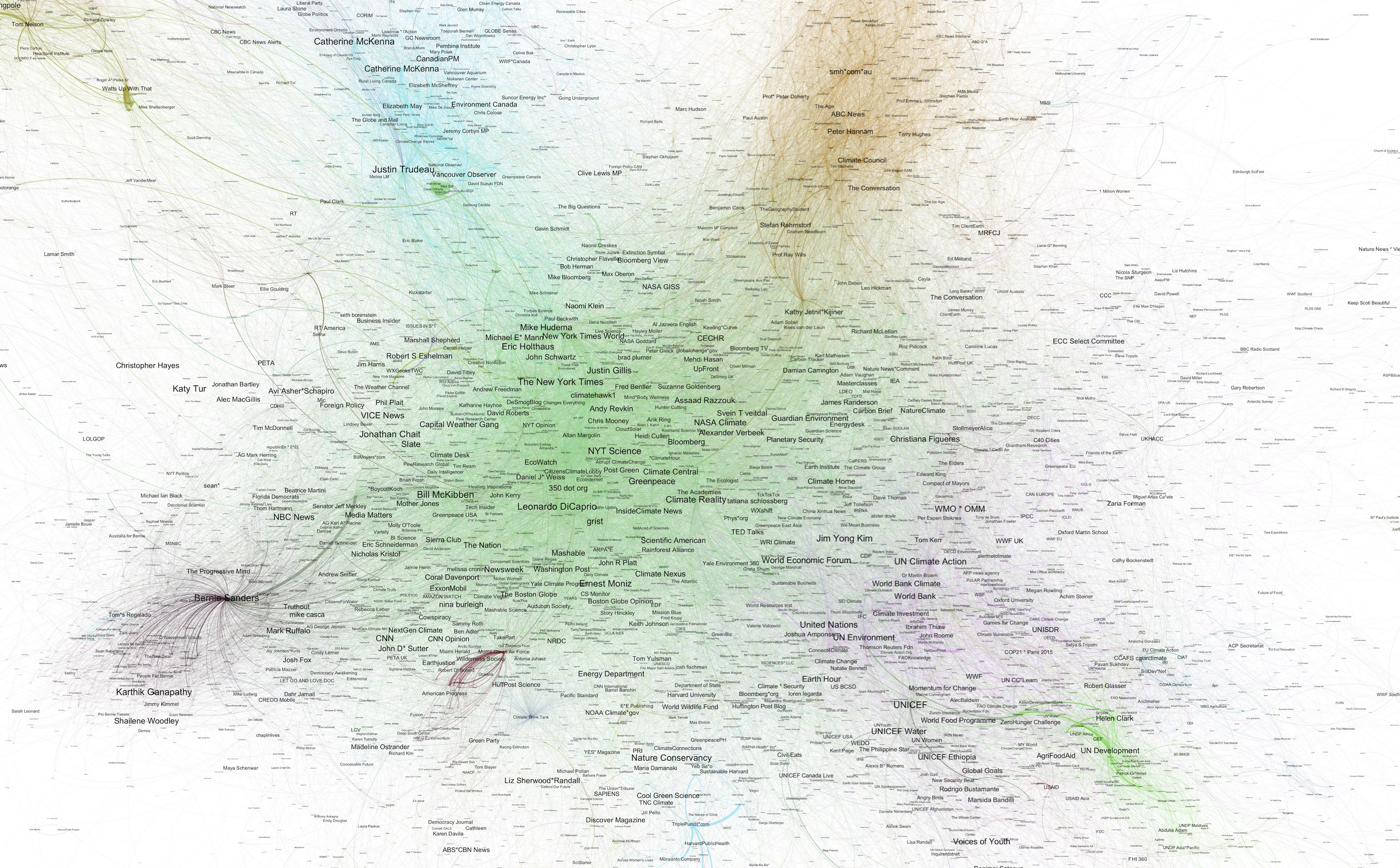
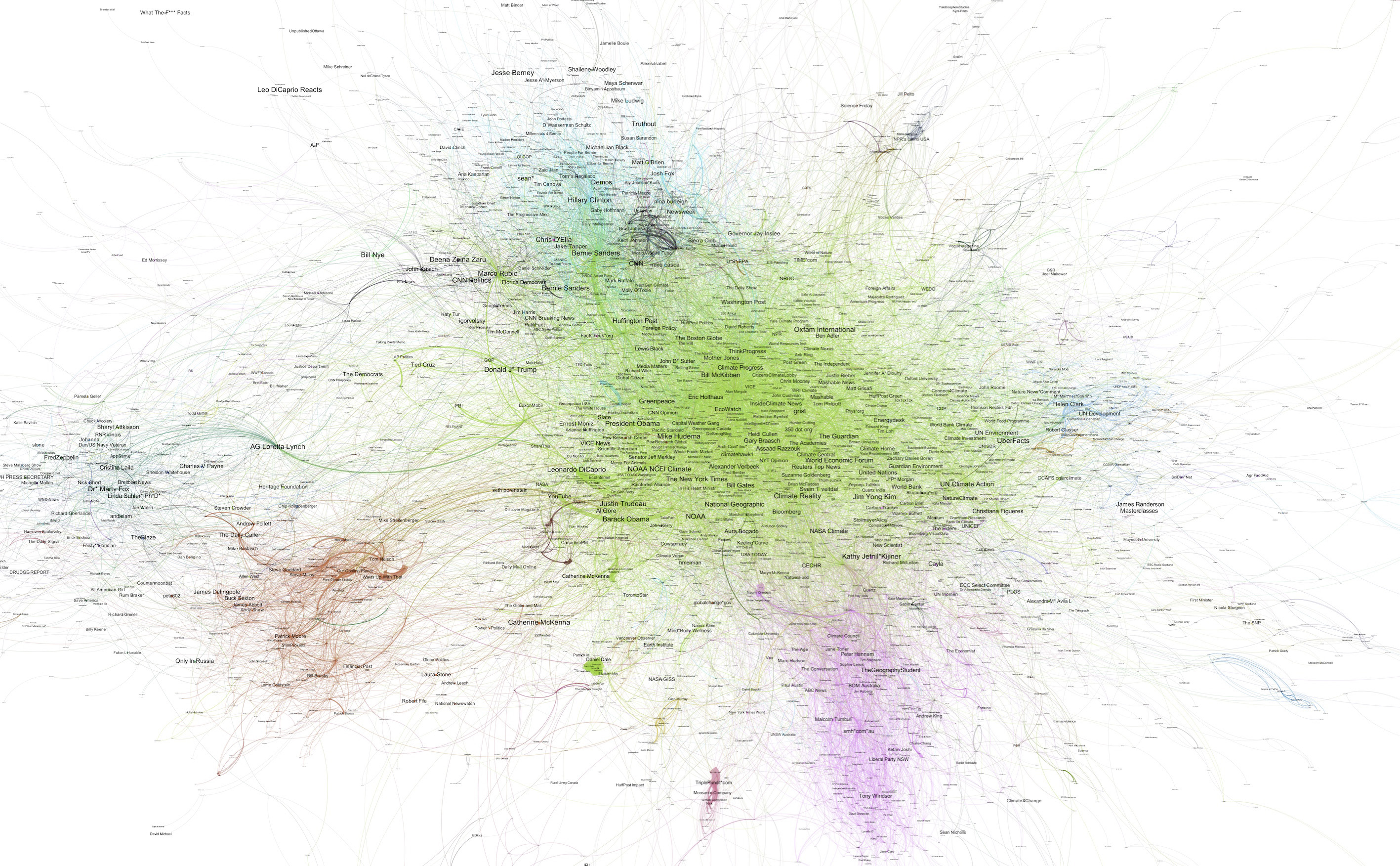
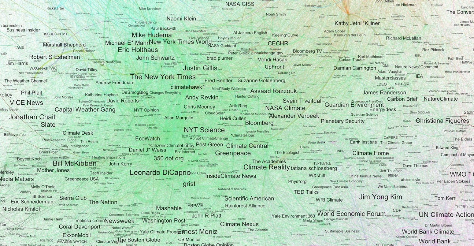
Networks of conversations (graphs) can be visualised in Twitter Maps as shown below.
In these maps, each dot (or node) represents a Twitter user and the lines joining them represent communication between users, according to retweets and mentions. The size of the dot represents the page rank of the user. In simple terms, page rank measures how “important” a node is based on the “importance” of the nodes which connect to it – “importance” denoted by links.
The width of the line between users indicates the quantity of links. Groups of users with large numbers of links (retweets and mentions) between them stand out as thick and dark lines. The “force-directed” algorithm is set up to organise users into groupings of strong mutual interactions, which tends to reflect mutual interests. Additionally, you can see who is engaging who by the direction of the “catherine wheel” of lines coming out of a dot. If the lines are suggesting a clockwise motion, that person is being mentioned and retweeted a lot. (See the “volume of users retweeting and mentioning Leonardo DiCaprio” map below.)
- Engage in frequent dialogue with other users
- Engage constructively with users with a large number of followers
- Engage with a diverse range of groups
- Retweet, reply and mention other users naturally (without use of automation)
So, rather than just showing who the important people are per se, this illustrates who the influential people are in the slice of time in which the communication took place. So, for example, Al Gore is recognised as a global influencer for climate change with a large number of Twitter followers, but what is represented here is how influential he was during this period of time.
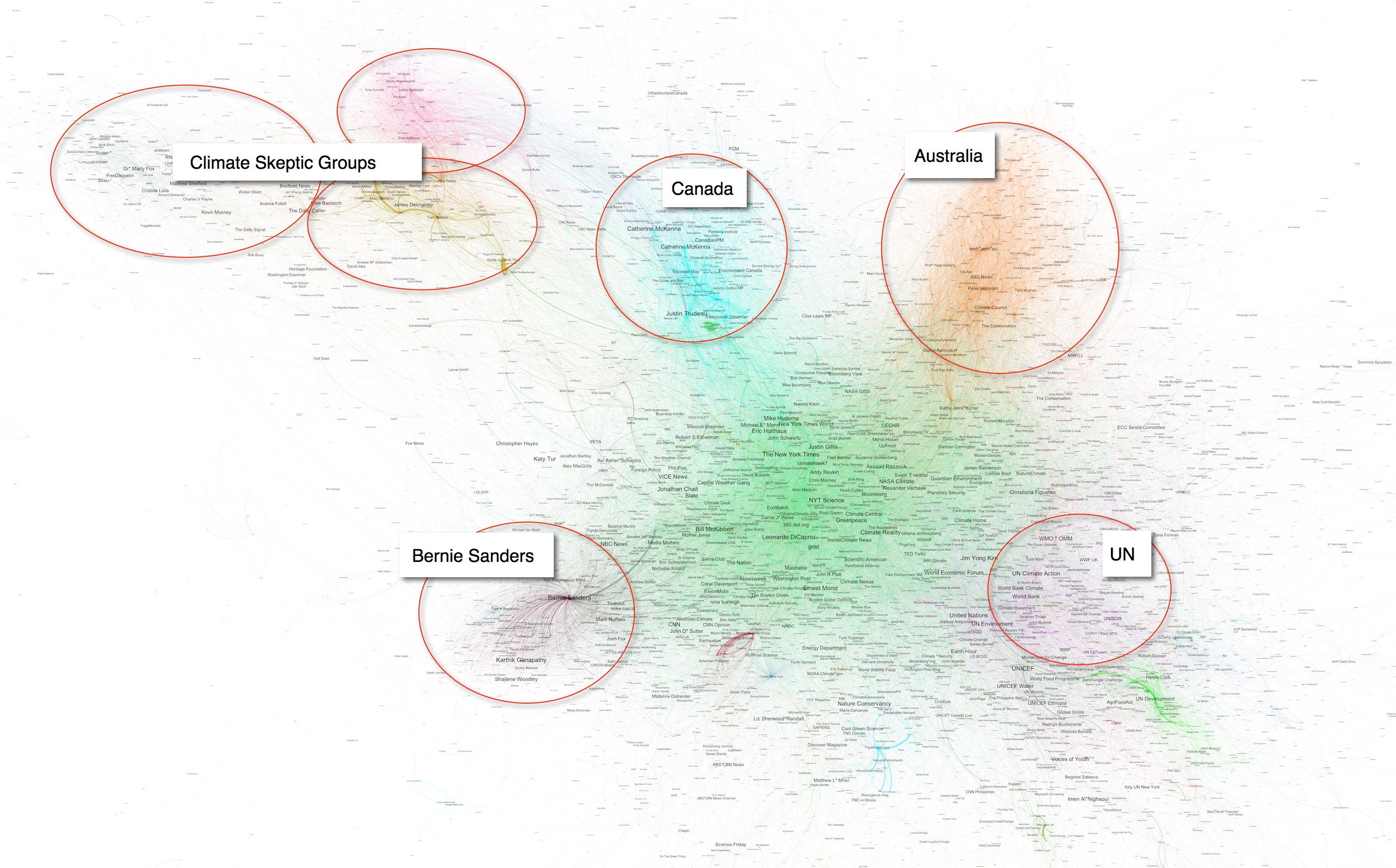
The colours indicate communities – or “tribes”, as we’ll call them – of users that communicate frequently with each other and may, therefore, share common interests, some of which are highlighted below. It’s worth noting that we haven’t manually coloured these tribes, or assigned them a specific colour. A machine-learning algorithm detects each “community” and they are coloured accordingly to provide the reader with a visual representation.
Orientation
When conducting an analysis of an overall social network conversation on a fairly wide ranging topic, such as climate change, it is important to first get an understanding of the general “landscape”.
To help smooth out the day-to-day fluctuations in the conversation, we chose to analyse a period of six weeks (28 Feb -10 April, inclusive, which includes a few days either side of the calendar month of March upon which the main map is based). This period contained approximately 2m tweets sent by more than 800,000 users. This includes any tweet sent containing a handful of relevant terms, such as “climate change” or “global warming” (see below).
The total number of connections over the period was more than 20m. The main map at the beginning of this article contains around 3,000 users and 13,000 connections extracted from the overall “climate conversation” network. To give a sense of how this compares to the entire global conversation taking place on Twitter for all subjects, each day 500m tweets are sent via Twitter.
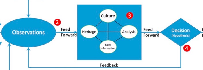
In order to make sense of such volumes of information, we use a process borrowed from military intelligence called “OODA Loop”, where OODA stands for Observe, Orient, Decide, Act.
The process illustration below gives a high-level overview of the process with links to where you can find more information about the process and the technology used to implement it.
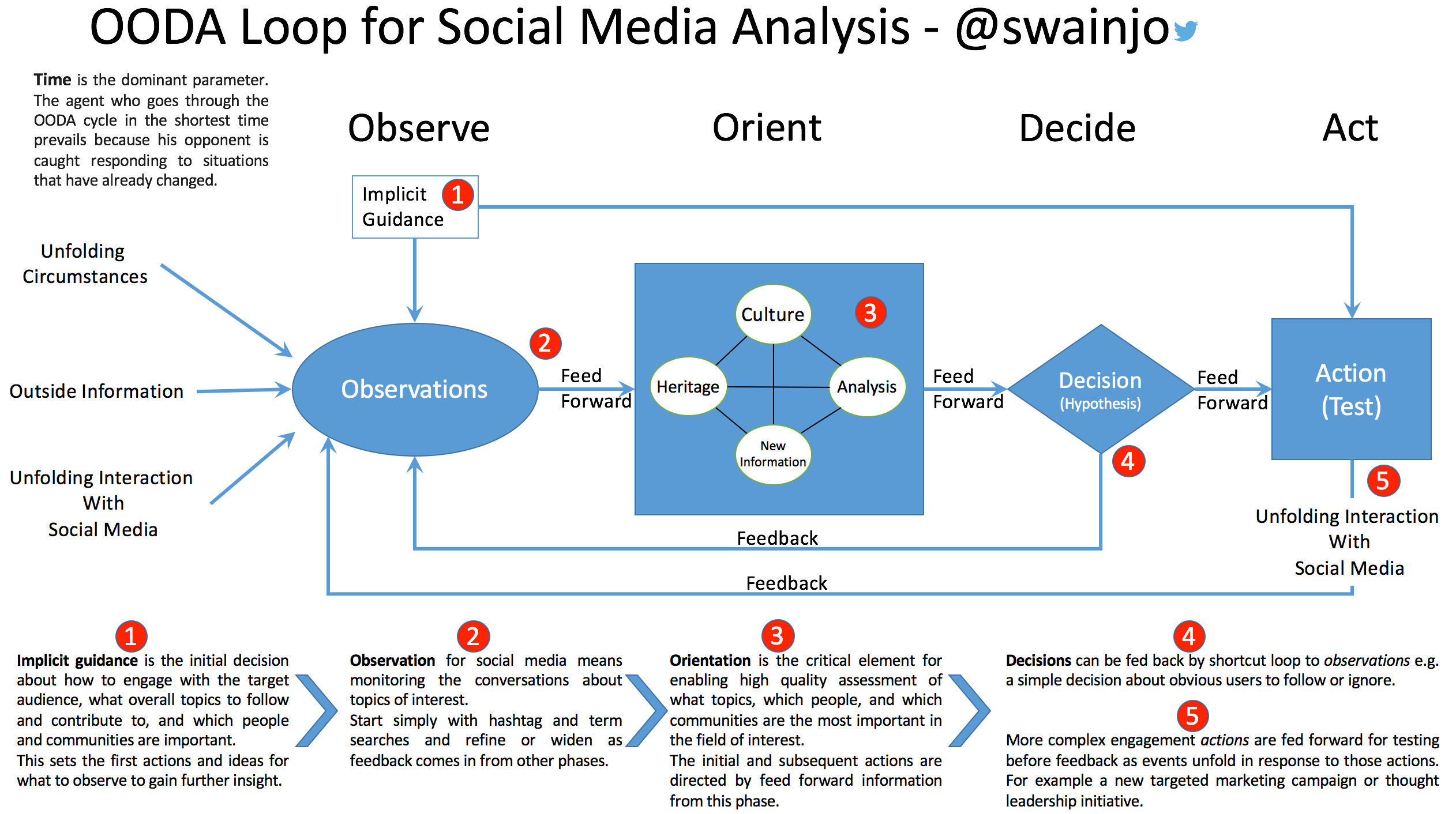
Overview of OODA Loop Process. Details of the process can be found on Prezi and in another blog post.
What follows is a summary of some of the elements of this process that we conducted in order to evaluate levels of influence in the climate change conversation on Twitter.
The examples we give focus on the “Observation” and “Orientation” phases showing how specific events shaped our knowledge of the overall network of conversation.
All analysis of this type has to start with our “Implicit Guidance”. The key part of an Implicit Guidance is not to spend too much time and effort speculating about what subjects and people will be important. The principle is to make a sensible first estimate of the information required and then run the Orientation and Feedback phases to refine this. In this case, we started with a search to cover a wide range of topics on the subject of climate change.
The search used during this period was for tweets in English matching the following:
Leonardo DiCaprio
The events of the first few days from our period of analysis provide a good example of how this process works in practice. We had just started collecting data over the last few days of February when the actor Leonardo DiCaprio won an Oscar, citing climate change in his acceptance speech.
Beyond humbled by this recognition. #TheRevenant shows the beauty of nature. Help protect it https://t.co/iGQ2c9fmEn pic.twitter.com/bTOrhF15RY
— Leonardo DiCaprio (@LeoDiCaprio) February 29, 2016
This is the perfect example of the “Unfolding Circumstances” input shown in the OODA Loop process diagram above. The Oscar win and speech created a Twitter storm – a large volume of tweets from the wider public, which we captured in our tweet collection process.
Here is a map of the climate change conversation on Twitter just for the week ending 6 March.
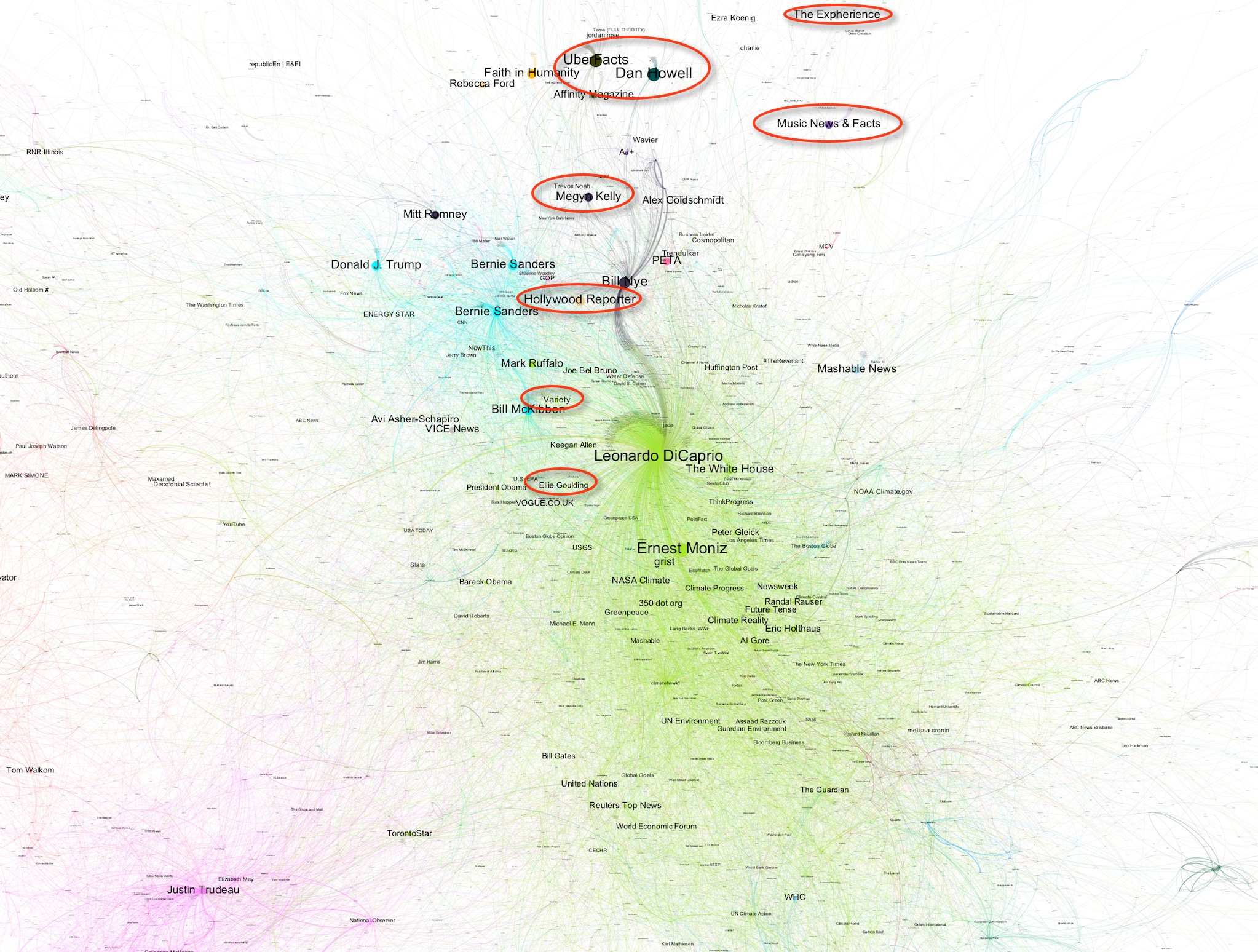
Twitter Network Map, week ending 6 March 2016, close up of central section. Users tweeting about Leonardo DiCaprio highlighted.
Not only is Leonardo DiCaprio the most prominent user on the map, but there are many others who are also prominent that would not normally be influential on the subject of climate change.
In normal circumstances, the graph theory techniques we use would correct for various elements of skew, including tweets from users with very large numbers of followers.
In this case, however, the event of winning the Oscar and using the speech to talk about climate change was picked up by other influential users. It wasn’t just legions of fans creating traffic, although that was also significant.
The map below includes the tens of thousands of smaller users that our algorithm would usually filter out of the maps in order to visually illustrate the size of the effect. On the left-hand side, for comparison, you can see the account of Barack Obama.
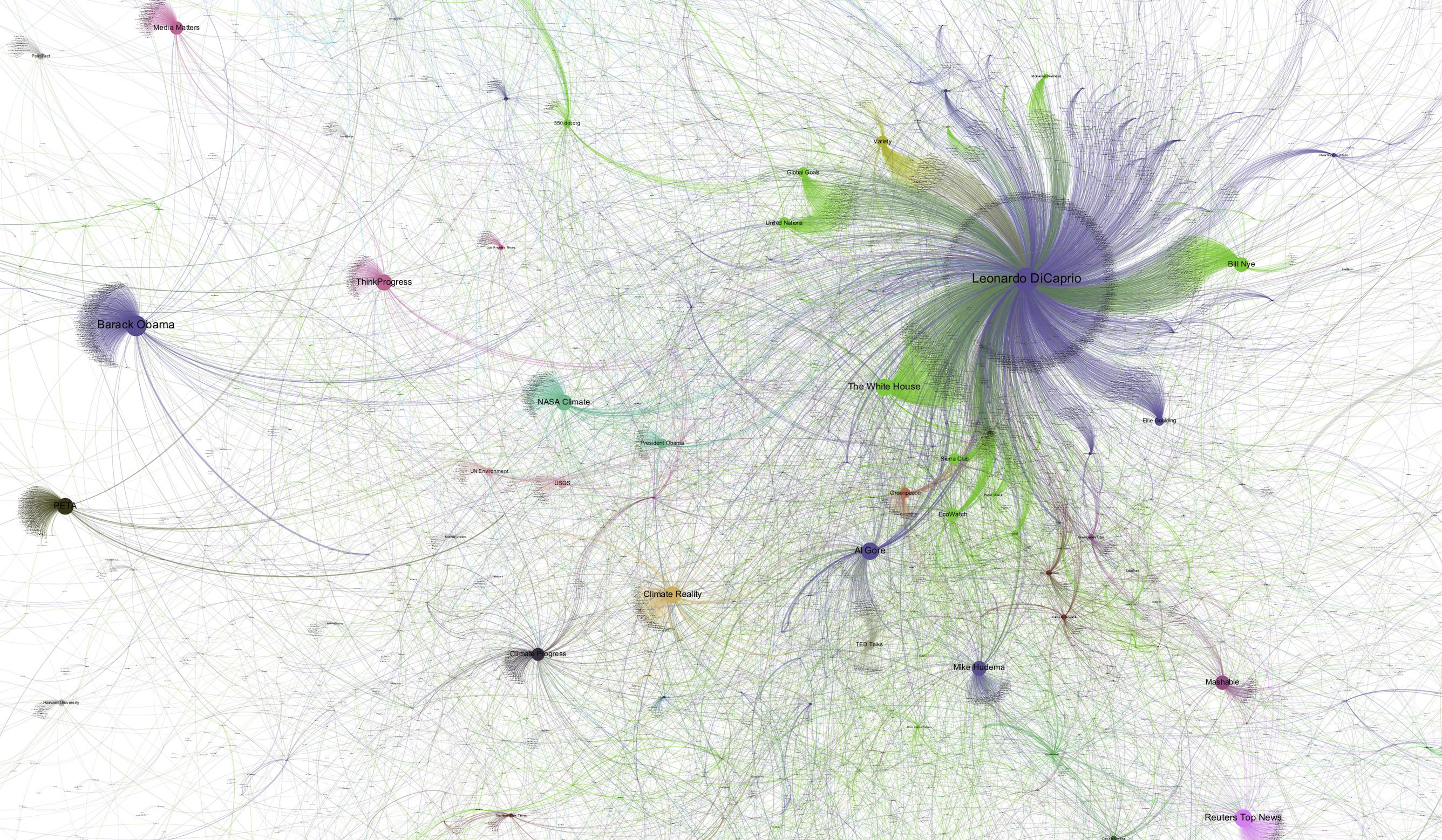
Twitter Network Map, week ending 6 March 2016, showing the volume of users retweeting and mentioning Leonardo DiCaprio.
Below is a list of the top tweets from our data set during the week that referenced Leonardo DiCaprio. You can see that there are some serious influencers in the list, such as the White House, Greenpeace and UN.
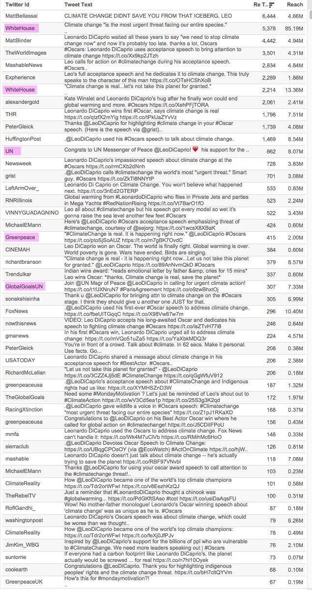
List of top tweets (by number of retweets) mentioning Leonardo DiCaprio in the week ending 6 March 2016.
It was apparent in the few days that followed the Oscars that this was a significant effect. It signalled to us that an action was required at stage 4 of the OODA Loop process – a decision to feedback into the Observation and Orientation phases in subsequent iterations.
As mentioned above, the graph theory methodology includes techniques for correcting for this kind of bias. However, in this case, an important part of the objective is to ensure a bias-free methodology. Therefore, we needed to exercise care when making decisions which might filter out the representation of certain points of view.
In this case, it was clear that the Leonardo DiCaprio situation had introduced an element that was clearly not relevant to the conversation on climate change.
The Twitter map below highlights certain prominent users who are explicitly “experts” in domains other than climate change. For example, Ellie Goulding and Vogue are not known for conversing about climate change, but did tweet about DiCaprio’s Oscar speech. That is not to say that we can disregard their contribution, but, rather, that we can make decisions about evaluating influence in the context of this knowledge.

Twitter Network Map, week ending 6 March 2016, close-up of central section. Users tweeting about Leonardo DiCaprio highlighted.
At this point, therefore, we knew that we needed to correct for a bias introduced by the Oscars events. Feeding back this information into the Orientation phase, we then looked at the same information a different way.
The Twitter map below is for the same period (week ending 6 March). This view shows a subset of the overall network known as the “Strongly Connected Component”. This means that only users who communicate with each other in both directions (e.g. retweet each other or mention each other) are included. This has the effect of including only the users engaged in a conversation. Users such as Leonardo DiCaprio and President Obama are not included as they do not engage in dialogue with other users in this group.
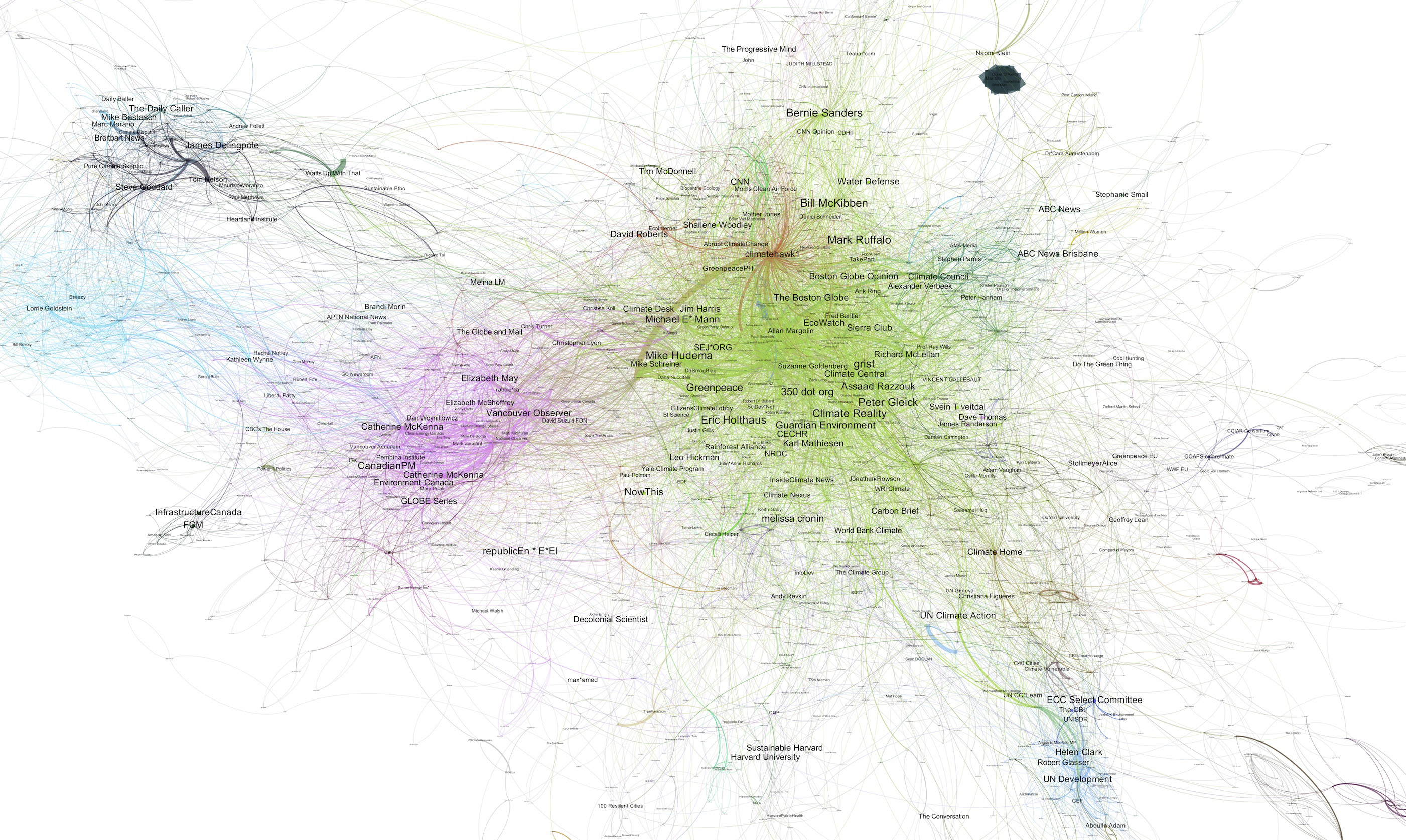
Twitter Network Map for Strongly Connected users, week ending 6 March 2016, close up of central section.
This new information is now fed forward into the Orientation analysis process. At this point, we make a decision about how best to meet our objectives. In this case, it is appropriate to put a higher weighting on the Strongly Connected part of the network and filter out some of the “noise” included in the wider view.
Ranking of influence
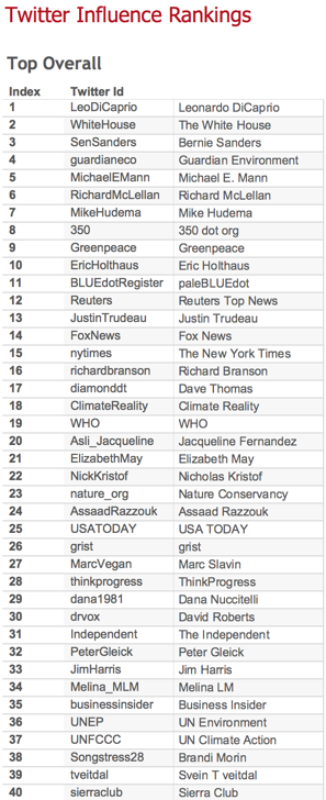
As indicated at the beginning of the article, one of the objectives is to find who the most “influential” users are on the subject of climate change. The table below shows the top 40 influencers during this first week.
So, during the week of the Oscars, we have identified that Leonardo Di Caprio and the White House were, in fact, the most influential users. Both were making relevant comments and seriously engaging in the climate change debate.
However, we have excluded the irrelevant users who were only commenting on the Oscars win and the overall conversation is represented in a balanced way. As you will see from the final Twitter map at the top of this article, the effects of this one-off event are diluted even further over time.
‘Deniers’
Next, let’s look at the week ending 13 March where we can see another effect at play.
In these maps, the colours indicate different communities of users identified by machine learning algorithms as being a strong community. At this level, the grouping on the map and the colours align quite nicely.
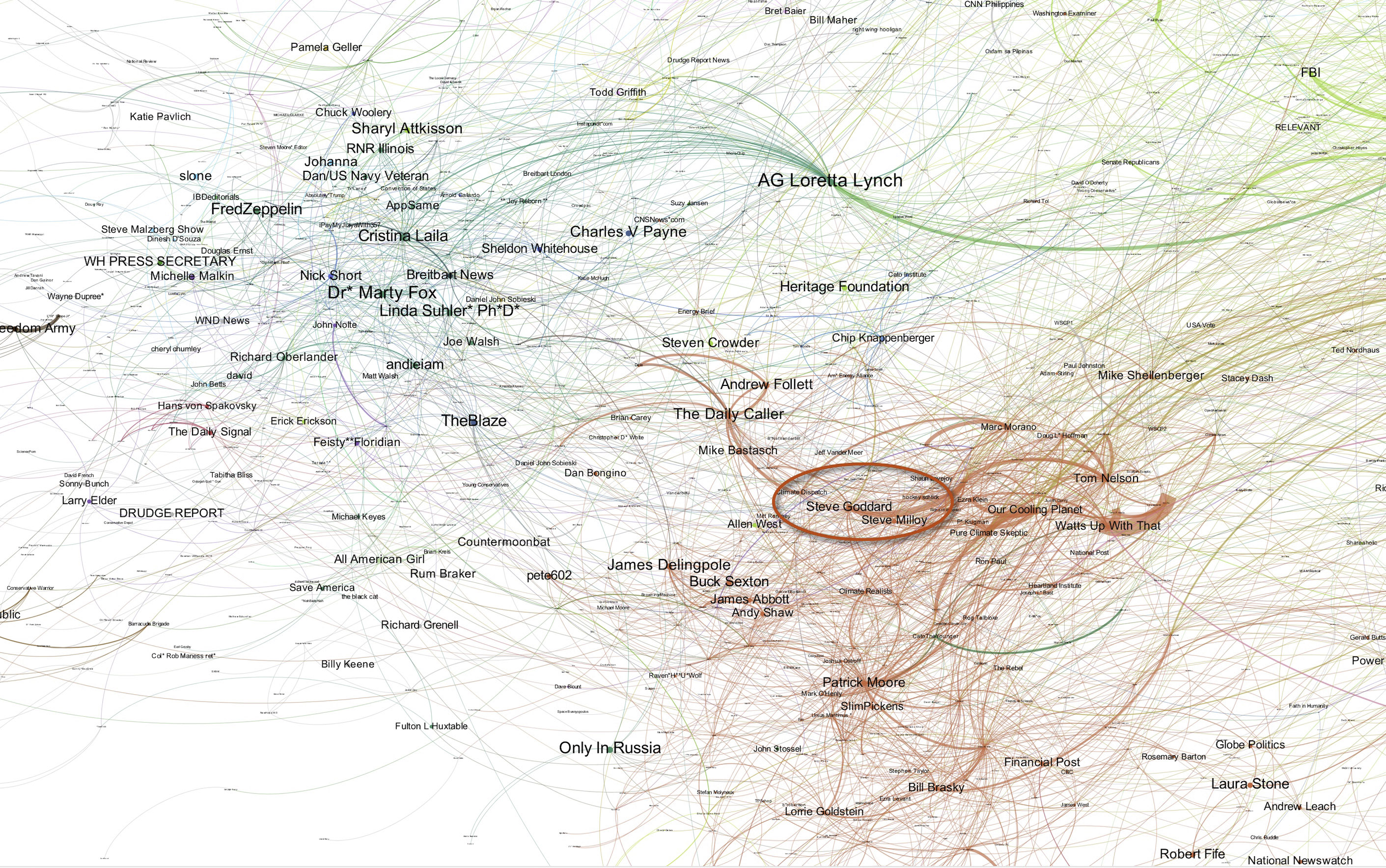
In the map below on the left-hand side are two groups of users coloured blue and orange.
Here is a closer view. From the names of the users in the these groups it is not immediately obvious what the common topic of interest to this group might be.
However, we can see a bit more detail about these groups in our dashboard application.
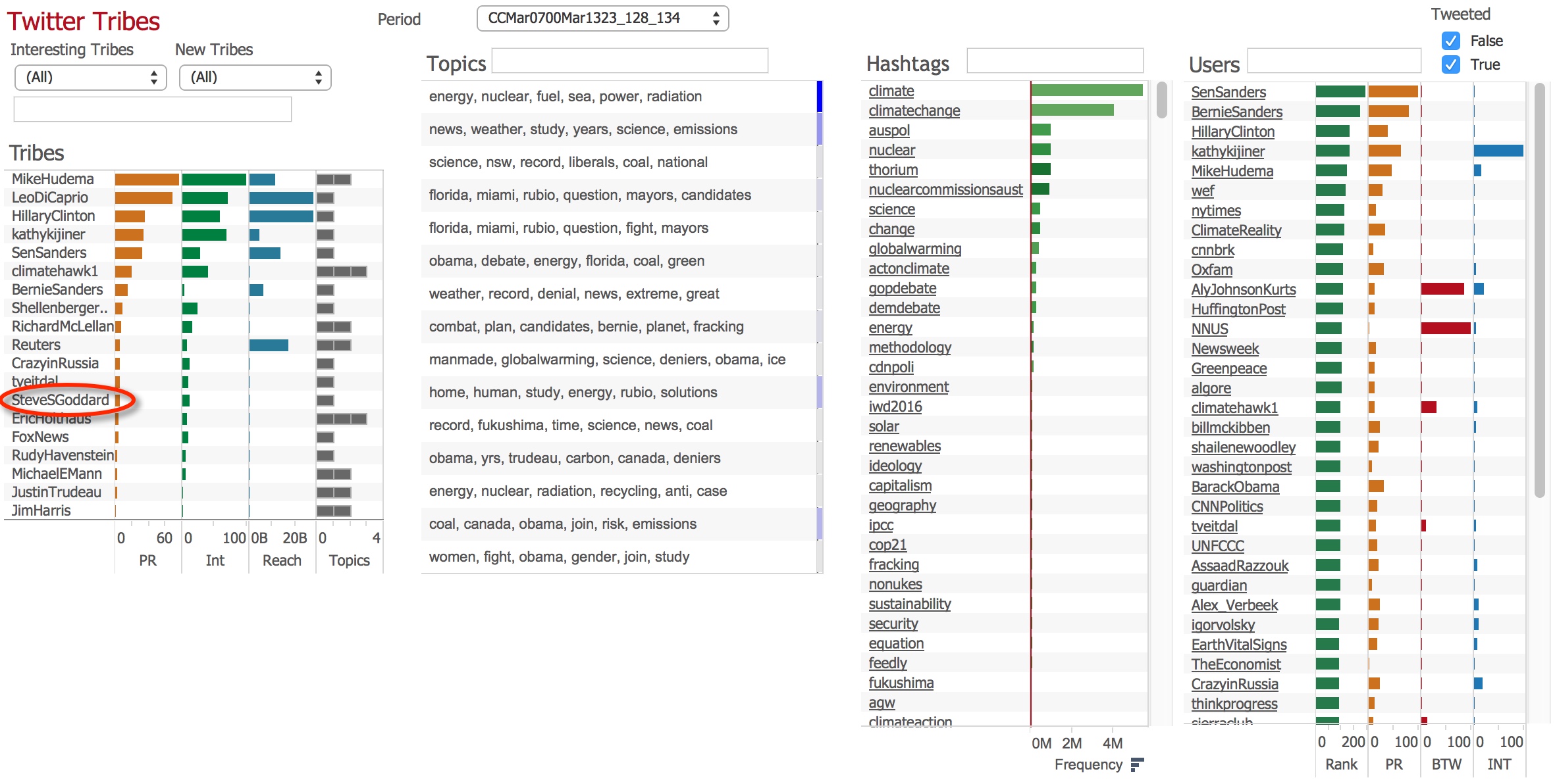
Here is a screenshot of the dashboard. Highlighted in the “Tribes” list (our name for communities) is the tribe in which SteveSGoddard is the most influential user. This tribe approximately corresponds with the orange group shown in the map.
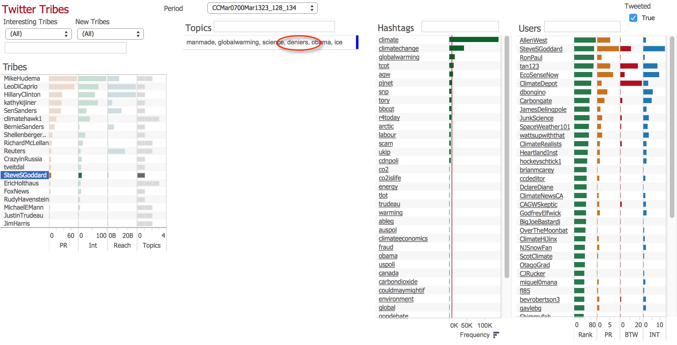
By filtering the dashboard to the SteveSGoddard tribe, we can get some insight into the topic of interest which is causing the members to cluster together.
The “topics” list in the centre is a list of topics which is identified from the content of the tweets by a machine learning process. Once the SteveSGoddard tribe is selected, the topic list is filtered to the topic which is detected in the tweets from that Tribe.
The highlighted term “deniers” is of potential interest. (“Deniers” is not a term we have chosen, rather it’s one the algorithm detects from the tweets and highlights as best representing this group).
Here is the list of topics in which SteveSGoddard is influential, as detected by the Right Relevance service.
Here is a list of the top tweets which were sent from this tribe.
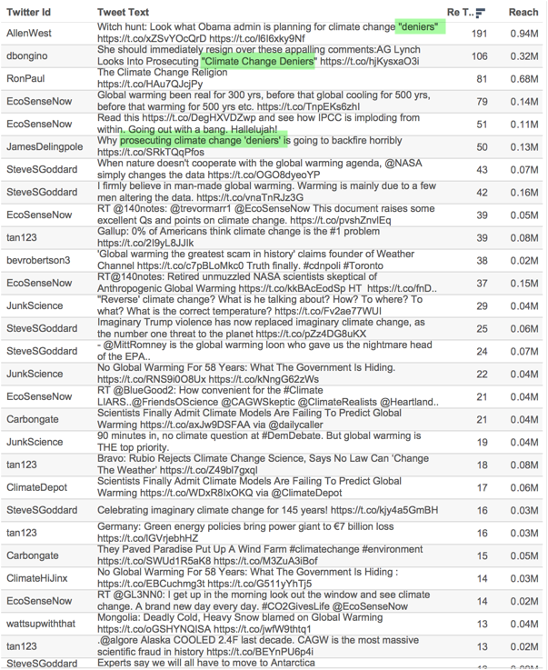
List of top tweets (by number of retweets) in the Tribe of SteveSGoddard during the week ending 13 March.
It is immediately clear that the overall topic of interest is climate change skepticism and the term “deniers” appears in some of their own top tweets (which is why the algorithm chooses that term to describe the tribe).
As an example, this is the particular story that generated the reaction on Twitter.
Witch hunt: Look what Obama admin is planning for climate change “deniers” https://t.co/xZSvYOcQrD pic.twitter.com/l6I6xky9Nf
— Allen West (@AllenWest) March 11, 2016
This is the particular story that generated the reaction on Twitter.
Which also explains why Loretta Lynch is close to these groups in the Twitter Map.
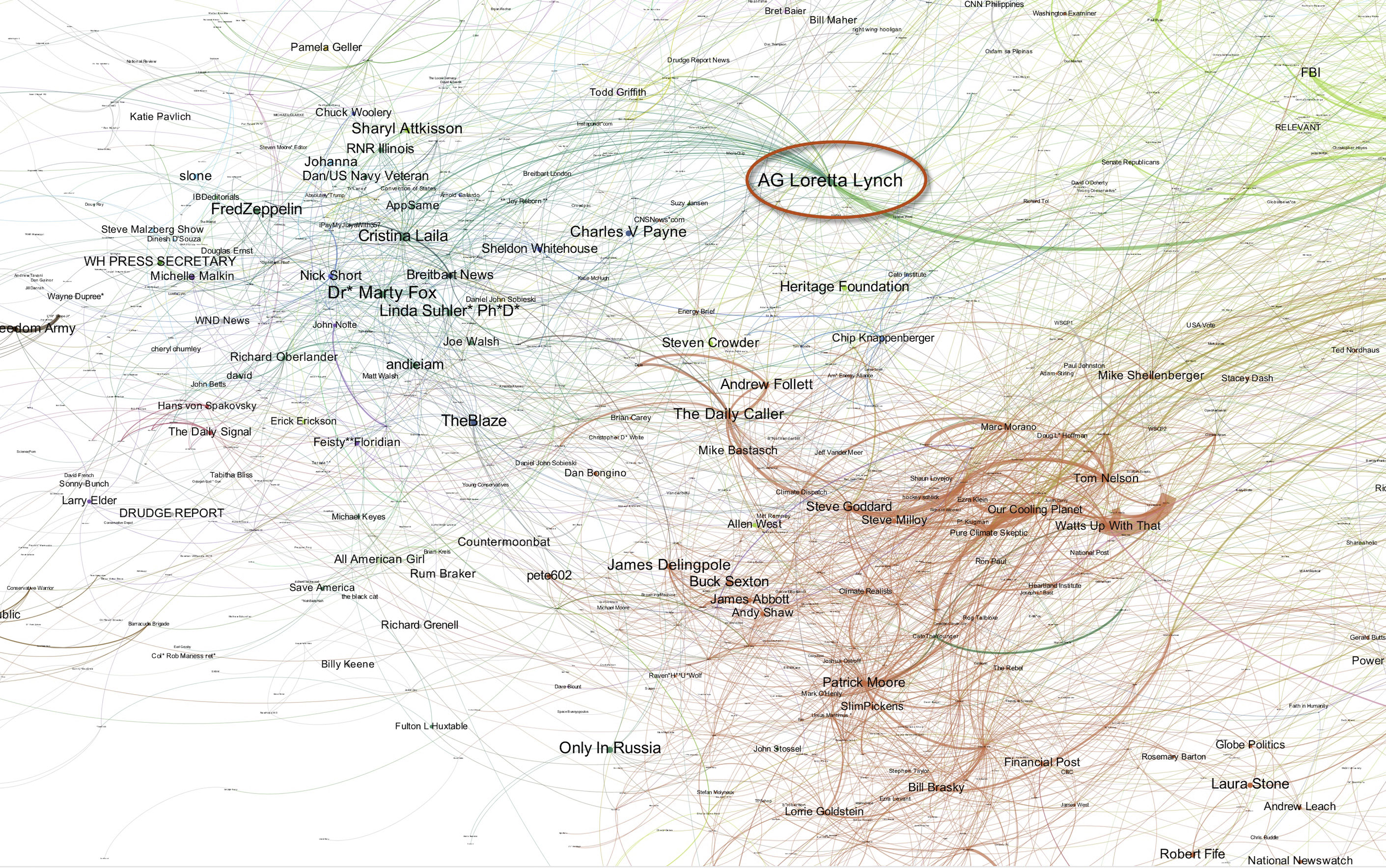
Twitter Network Map, week ending 13 March. Close up of two interesting communities. Loretta Lynch highlighted in close proximity to skeptics communities.
From the maps and the dashboard, we have identified that there is a small, but clearly identifiable group of users with a shared interest in climate change skepticism who engaged in the conversation during this period.
What is striking about this particular group is their comparative isolation from the rest of the map. This means that they converse a lot about climate change, but almost exclusively among themselves. They rarely retweet or converse with people outside of their tribe. Equally, they are rarely ever retweeted or mentioned by people outside of their tribe. This would more conventionally be called an “echo chamber”.
We have, therefore, identified a community who we might want to observe as our monitoring of the climate change conversation on Twitter builds over time. In future articles, we will focus on some of the other detectable tribes.
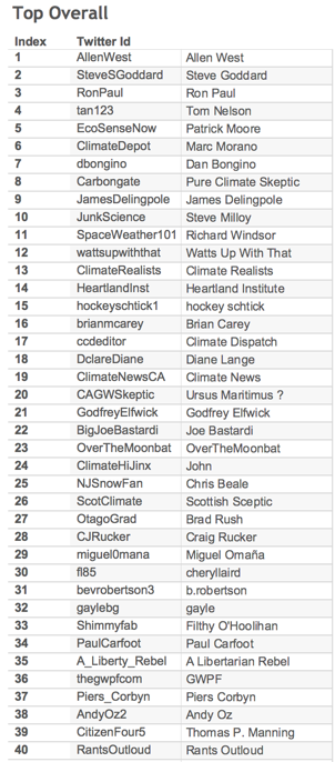
Here is the Top 40 most influential Users in the SteveSGoddard Tribe for the data collected during the week ending 13th March:
A full month
One of the key objectives for this project, as set out by Carbon Brief, is to rank the most influential users. Ranking in this context is not like the table of a football league where there are controlled rules and scores. In many ways, the selection of which topics and, therefore, which tweets to include is arbitrary and can only ever reflect one view of the world at anyone time. In reality, a whole subject, such as climate change, is made up of many sub-topics and it is impossible and, to some extent, meaningless to attempt to capture everything.
Time and tempo
One of the fundamental principles of the OODA Loop process is time. This is often about speed of reaction to changing events.
So far, in this case, the ability to cycle quickly is less about reacting to short-term events, but, rather, informing our understanding of how short-term events affect the overall picture.
Our objective is to establish a long-term stable map of the topic being discussed on Twitter and then use that to gain insights into the ways the users interact, form tribes and how they compare. However, if we did not run the shorter term analysis, which detects the skews and communities during certain periods, we would be unable to understand how those fluctuations fit into the bigger picture.
As mentioned above, during the initial period of six weeks we collected a total of 2m tweets, 800,000 users and 21m connections.
After several iterations of analysis of short-term (daily, weekly) periods, which addressed issues, such as the examples of weekly periods mentioned above, we concluded that on this subject the fluctuations would smooth out over the period of a month. So the map at the top of this article uses the data we collected during the full month of March.
We decided that there was not a good reason not to run the analysis on a natural weekly and monthly cycle. The process runs continuously and is monitored daily, so when an unexpected event (or planned event, e.g. COP21) occurs we can switch to a daily cycle.
Tables
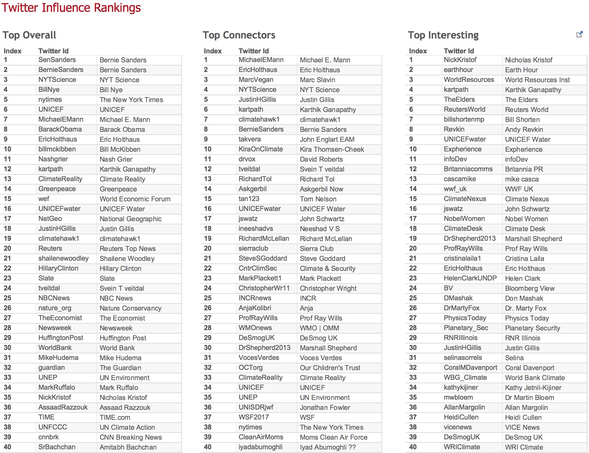
We have produced tables ranking the most influential users over this period of time (March 2016) in three categories as follows:
Top overall
Top overall influence is measured by combining the quantity of connections (retweets, mentions, replies), the quality of the connections (measured by Page Rank) and the reach (number of users who could see retweets) of the users tweets. These are adjusted to discount the skew towards users with very large number of followers by using a factor based on the log of the number of followers.
Top connectors
The value of a user’s connectedness is measured using an algorithm called “Betweenness Centrality”. This measures how well a user is “connected” to all other users – compared with everyone else.
Most ‘interesting’ users
The “Interesting” metric finds smaller users who made a relatively high impact. It compares how well a user does in the overall ranking compared to how well they would be expected to do given the number of followers they have.
It is useful for finding niche or local stories in a large network where they are difficult to find.
The table below shows these three categories during March.


